

Hello! I'm Jitto Alexander, a User Experience Designer. I make people's lives better by arranging boxes and text in magical ways.
I thrive on challenges that stretch my capabilities and fuel my passion for creating impactful designs. My approach is anchored in mastering the fundamentals, ensuring every decision is rooted in objective thinking and a deep understanding of user needs. These guiding principles drive me to craft solutions that are both intuitive and effective, delivering meaningful experiences that resonate with users.
Work History
The places and experiences that leveled up my design game.
Kenna
Nov 2018 - Present
UX Designer
I designed and improved user experiences across 30+ apps and 5+ platforms for BASF, collaborating with teams to ensure consistency and accessibility, while managing design systems and components.
Kreatorverse
Aug 2021 - Nov 2022
UX Consultant ( Freelance)
As a design consultant for Web3 financial services, I developed scalable design processes for a social media app, led the design of a crypto payment system, and crafted user experiences for an NFT marketplace.
Chango
Oct 2018 - Nov 2021
Co-Founder / UX Designer
I led the design of a personal finance and financial literacy app, overseeing everything from user research to product experience. I developed a design framework for diverse learning content and collaborated with freelancers, developers, and conducted user testing.
Freelance
Jan 2018 - Oct 2018
UX/UI Designer
Worked with software development studios to design user interfaces & Branding for clients in the B2B and B2C space.
Design Principles
My approach to each project varies depending on the goal. In general, I keep a few thoughts in mind throughout the design process.
🧱
Stick to the Basics
Try to get the basics right, as it helps to address a lot of design problems
🧠
Design Thinking
Keep the user your primary focus but never lose sight of business goals and tech possibilities, because without either there is no product for the user.
💭
Retrospective
If I look at my past designs and say "Did I design it" then I think have become a better designer.
🧩
KISS
Keep it Simple Stupid (KISS). Even complex problems may have a simple solution.
📈
Continuous Improvement
Strive to design a product that is both scalable and adaptable, capable of effectively navigating shifts in technology, goals, and environment.
Process
My approach to each project varies depending on the goal. In general, I keep a few thoughts in mind throughout the design process.
01
Research
Understand user needs, behaviors, and pain points.
02
Design
Create an initial design solution that addresses user needs.
03
Prototyping
Develop interactive versions of the design for user testing.
04
Testing
Evaluate the design with real users to identify issues or areas for improvement.
05
Feedback & Iterate
Use the feedback gathered during testing to refine and improve the design.
Work
Stuffs that made someones life better!
Case Studies
These case studies provide a detailed look at my ability to deliver impactful UX design solutions. They showcase how I have successfully tackled complex challenges, optimized user experiences, and achieved strategic objectives. Each case study highlights my approach to problem-solving, the methodologies employed, and the measurable results achieved. Through these examples, you'll gain insight into my design process and the tangible benefits realized by users and businesses alike.
Vision Design System
Developing a Design Foundation to enhance the current Data Management & Reporting platform.

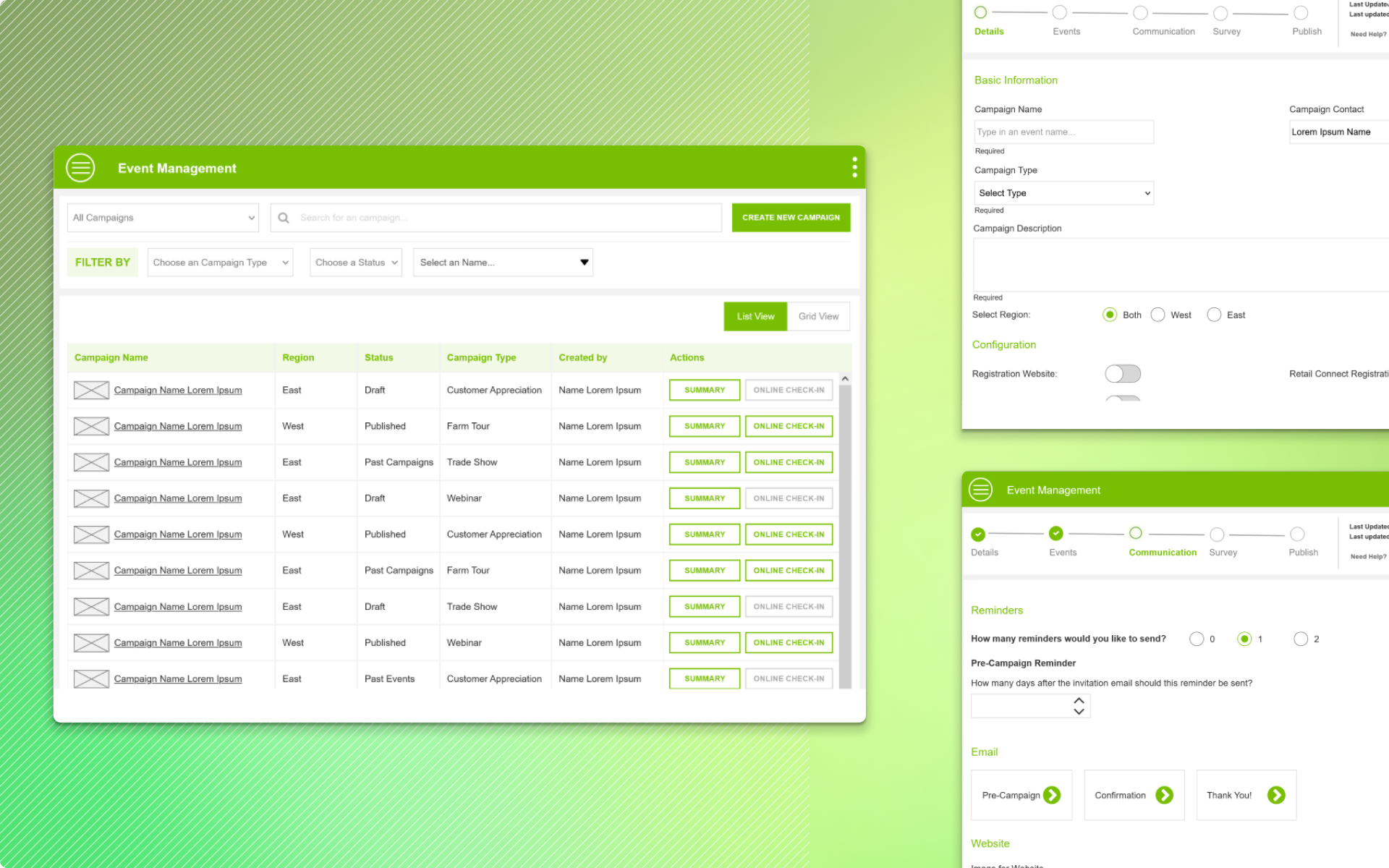
Event Management
Redesigning an internal Event management to address the User Experience Feedback.

Blocked Users
Leading the design of Web 3 Payment Gateway for Business & eCommerce to accept Crypto.

Chango
A Financial Wellness ecosystem that includes a Personal finance app, Financial literacy, and a Content Management System.
Few other Problems Solved
A selection of problems I've enjoyed solving. I've had the opportunity to work on a wide range of domains and diverse persona, this enabled me to gain valuable insights.
Curd Network
Guiding the design process for a Web 3 Social App that prioritizes establishing a trust-based network.
InVigor Results
Map tool to help Farmers make informed purchase decisions
Intrxn
Leading the design of Web 3 Payment Gateway for Business & eCommerce to accept Crypto.
Weather Monitoring for GGO
Weather monitoring to help wineries stay on top of Weather Conditions.
FanAnywhere Marketplace
A NFT Marketplace to connect fans and Celebrities
Farm Post
Redesigning filters to improve the accessibility of content
Chango: Unifying your financial world
Creating financial well-being for our users through a blend of personal finance & financial literacy; thus, empowering them to make smart financial decisions through our unique platform.
My Role
I led design of Chango Personal Finance & Financial Literacy app from ideation to implementation.
Timeline
Oct 2018 - Oct 2021
Team
Design Lead/Co-Founder (me)
Founder, Graphic Designer x 3
Scope of Work
Research, User Interviews, Personna, User Stories & Flows, Information Architecture, Prototyping, Dev. Handoffs, User Testing.
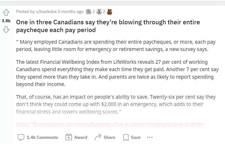
Problem
Canadians lack time, interest, and knowledge around money matters. They are scared and lost on money issues. Also, suffer from information overload.
48%
lose sleep over financial Stress
60%
have poor financial Literacy Skills
83%
have at least one financial Regret
Solution
Financial Wellness is a process and Chango focuses on improving one's relationship with money in one or more ways.
💳
Integrated Personal Finance App
A Unified Solution bringing the math of personal finance and financial literacy in one app,
💎
Value-Driven Content
Blogs, Financial FAQs, Financial Glossary
📘
eBooks
Free for all eBooks covering a range of topics from Taxes to Stocks.
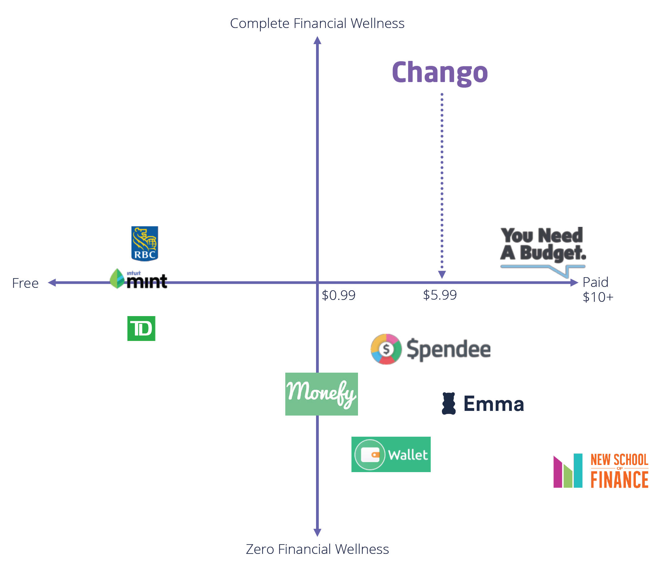
Research & Analysis
Market Research
I focused on understanding existing solutions and what they think they offer their customers.
Banks Offerings
Conversing with Bank Advisors
Trying out Personalized Tools & Apps
Customer Feedback from App Store
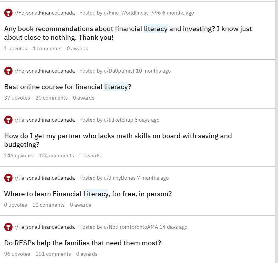
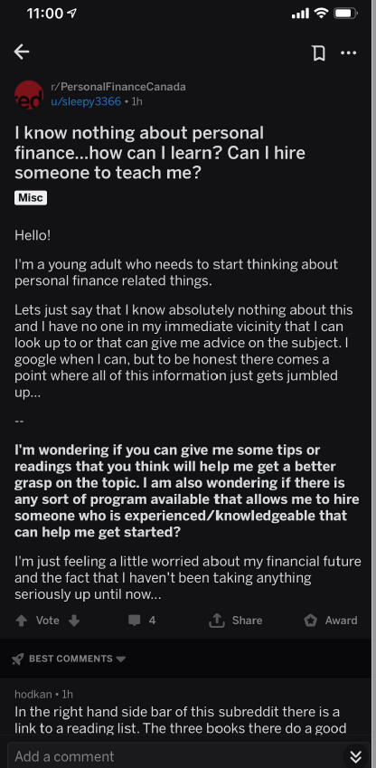
User Research
After the first round of User Research, where we spoke with friends, friends of friends, and social communities. Our Target personals were #Millenials and #Newcomers
In Step 2 we identified Potential Users from Reddit communities, Whataspp and Telegram groups who were struggling with managing Finance. Later this group became our focus group for further rounds of User Testing.
User Persona
Millenials
What Defines them
Wealth custodians
Digital native generation
ME centric
What Ailes Them
30% have basic to moderate financial literacy skills
46% do not have financial plans
38% declared bankruptcy in 2018
What They want
Knowledge that fills gap
Customized tech led financial solutions that suit there needs
Keep ME at the centre of it
New Comers
What Defines them
Educated, talented & skilled
Seek information crucial for living
Carry Hopes for a better future
What Ailes Them
>35% suffer from financial stress
Unemployment & underemployment
Poor/generic financial advice
What They Get
Dull pamphlets
Lengthy workshops
Biased financial advice
Preparing for Design Feasibility
Personally, I believe a good design should factorize the business and technical aspects to build a successful product. it’s just no enough to validate the idea with Users, but also think a bit more about the viability of offering a sustainable product to users.Understanding the tech stack helped define the design direction I was supposed to take, Flutter was the chosen package so the design was within the capabilities of Flutter.While I came up with a whole list of possible features for app, based on User feedback prioritized Features for MVP.
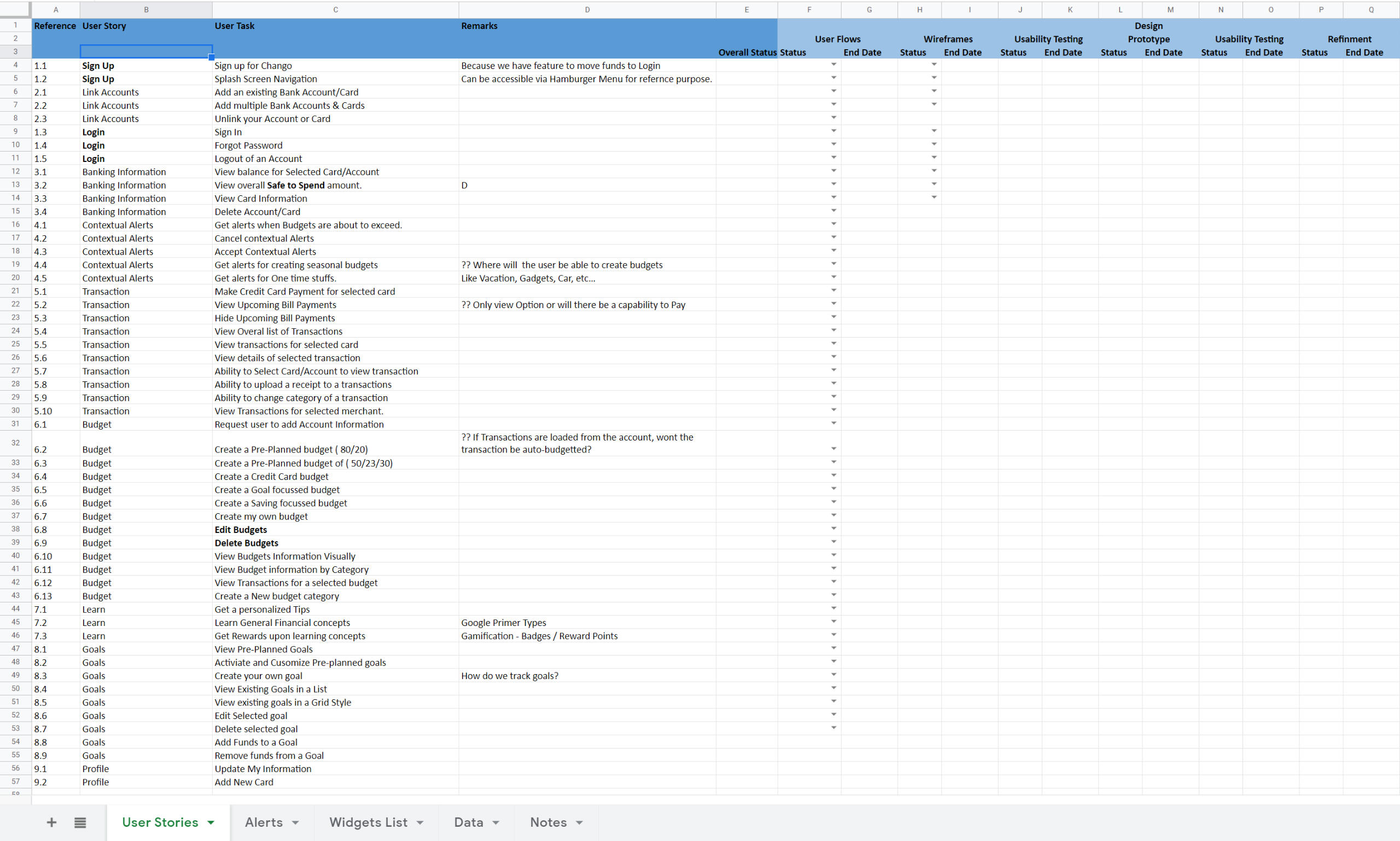
User Stories
Using the research outcomes I focused on four key aspects in writing the user stories.
Control
Keep a tab on finances, Manage flow of money.
Freedom
Choose to make your own decision as per your needs
Expect
Things can go wrong and they probably will. Expect the unexpected
Plan
The future is uncertain. Plan for it and take control of your life.
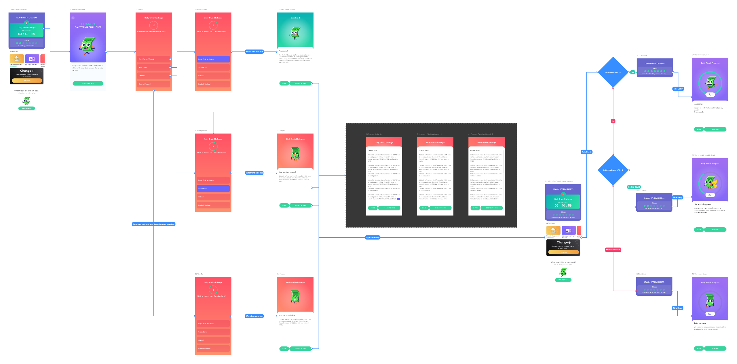
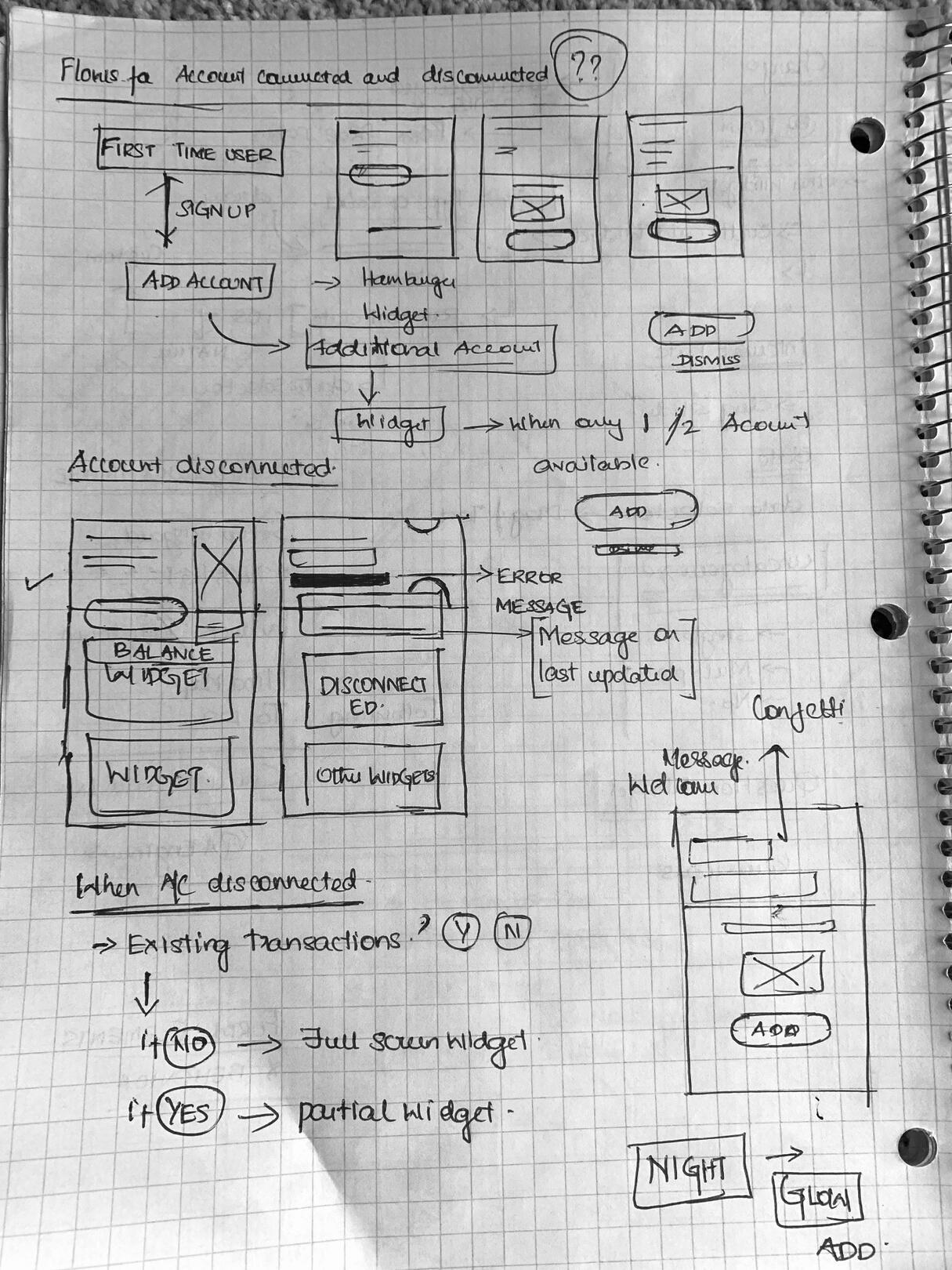
User Flow
The initial flows diagrams were done in Miro, later once the Wireframes were available I updated the to Overflow so it was easier for developers to visually understand the flows.
Wireframing and Prototyping
Given the scope of the project and the effort required. I proposed certain design decisions that helped managed the design process effectively.
Key Design Approach Decisions
Given the Size of the app and number of screens, I felt it would be overwhelming to build a fully functioning prototype. So Defined standard button and screen navigations, that can be reused across app.
Where more details as needed, build micro-interactions in Protopie and also identified similar Lottie files for implementations
The App was built on the Flutter framework so I used material design guidelines as a baseline for the design.
Branding Guide was already available so I jumped from Pen and Paper to HiFi Wireframes.
Pen and Paper
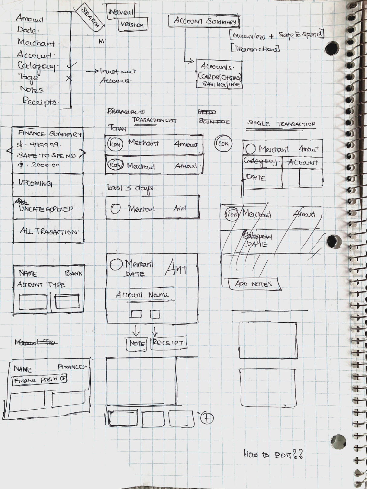
HiFidelity Wireframes
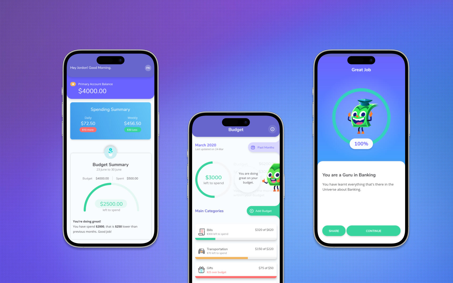
Highlights of few of the key features of the app
Dashboards
Get information that matters on your screen, Holistic, Concise & Simple
Insights
Recieve actionable plans to tackle over users and upcoming expenses
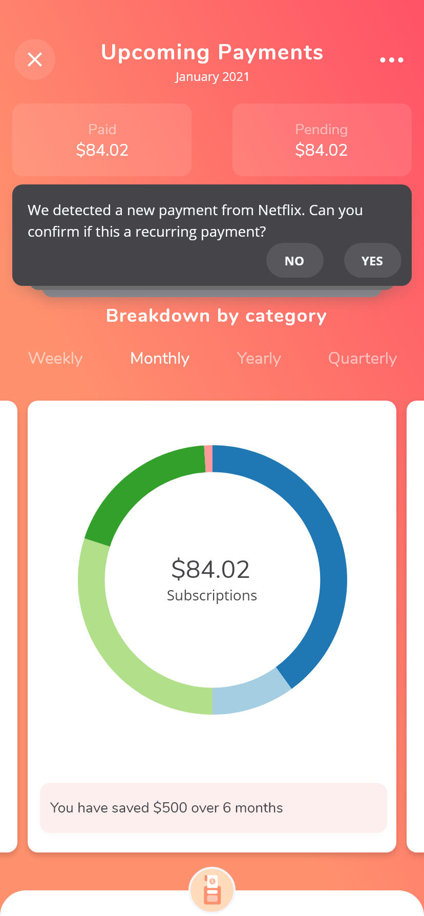
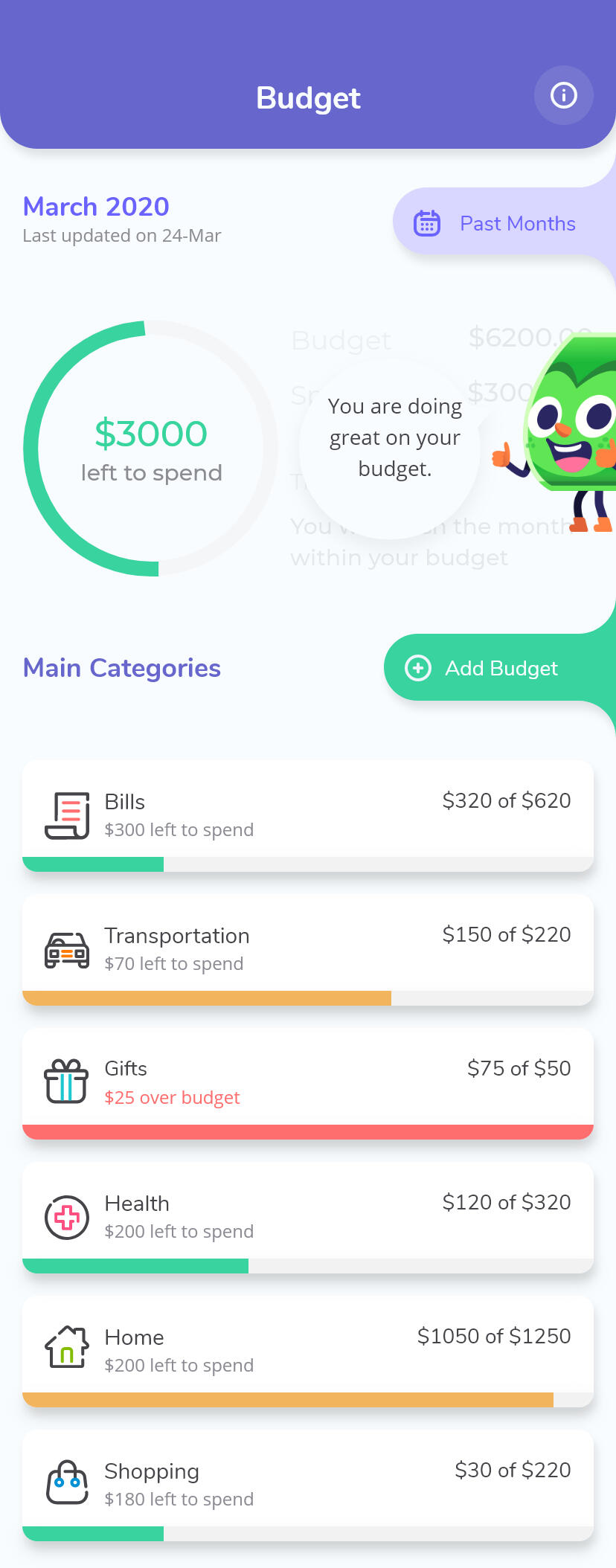
Budget
Add Budgets once and Chango Auto manages all your budgets and provides insights.
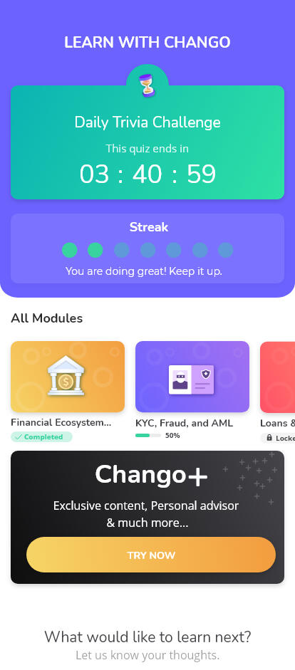
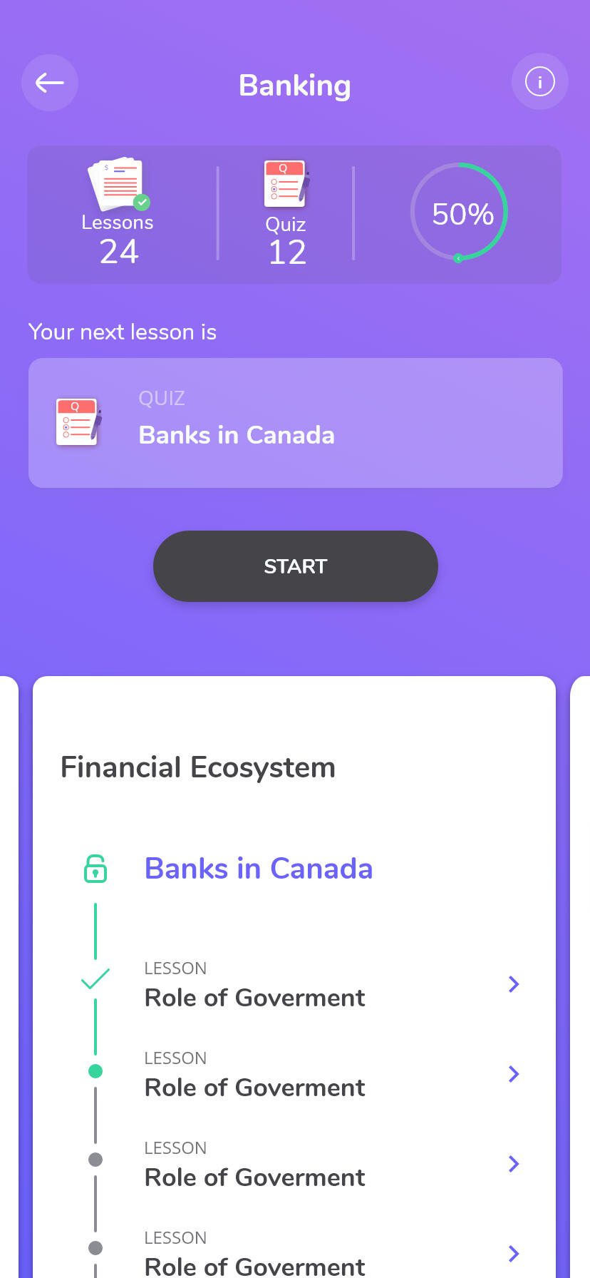
Interactive Learning
Learning modules are structured to consume byte size information, lets user familiarize learnings using quiz and Learning summary.
User Testing and Feedback.
Every team member had a preset User Interview script and testing link, which they would share with their focus group. Feedback was documented. On other occasions, user would respond to generic survey questions.
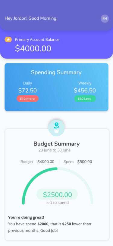
Before
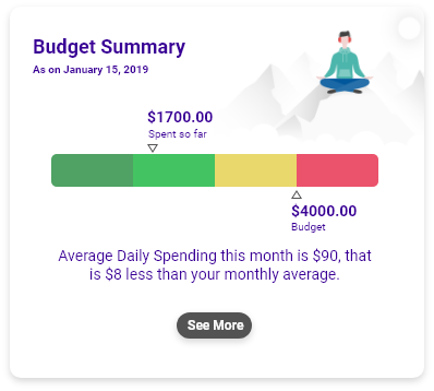
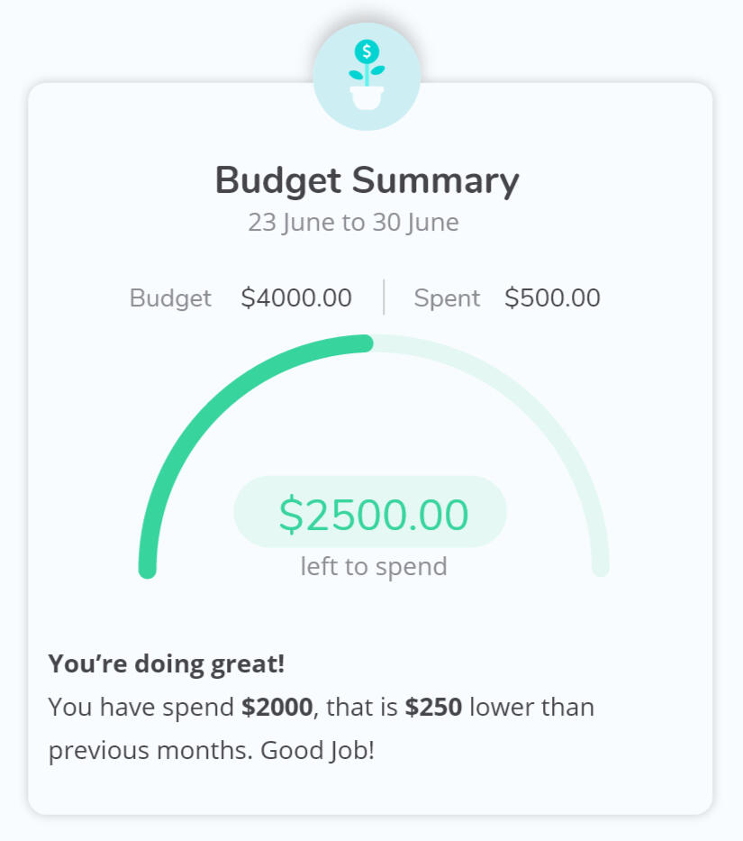
A/B Testing of Budget Summary Widget
I presented two ideas for the Budget Summary widget. I wanted to understand which conveyed the budget position better.
"Bar chart is difficult to read"
"I like the speedometer like chart, but there is too much information to digest"
After
Refining the widget
I cleaned up the Speedometer Widget to make it more focused and readable and added engaging micro-interaction.
Highlighted key data points
Removed transaction to keep things simple and focused
Updated Type color to a more readable black.
Replaced illustration with a clean icon to remove disturbance.
Added a Micro-Interaction to the icon to gain the attention of the user where is an update to the budget summary.
Before
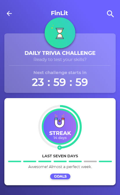
Analyzing User engagement on Daily Streaks
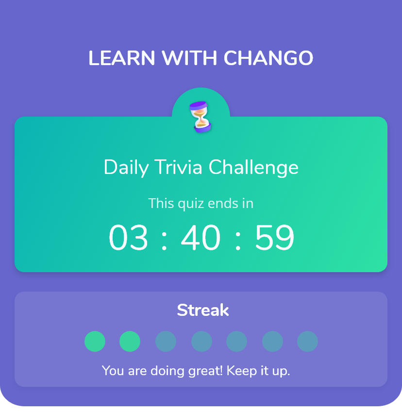
As part of User Testing we wanted to get user feedback on Streak and its impact on engagement.
The purpose of the streak and the circle is not very clear. Also having two different indicators "Overall" and "Last 7 Days" for streak was confusing Users.
Users found managing Goals complex and a bit of overkill.

After
Making user Streak work.
I cleaned up the streak widget to keep it focused on "Last 7 Days" streak and added alternate engagement factors.
Cleaned up streak widget to keep it compact and focused on "Last 7 Day Streak"
It also cleared up real estate to show up the learning modules within the default viewport sans scrolling.
Introduced the an animated mascot that pops up app launch to indicate their streak performance.

Before
Analyzing User engagement on Daily Streaks
As part of User Testing we wanted to get user feedback on Streak and its impact on engagement.
The purpose of the streak and the circle is not very clear. Also having two different indicators "Overall" and "Last 7 Days" for streak was confusing Users.
Users found managing Goals complex and a bit of overkill.
After
Making user Streak work.
I cleaned up the streak widget to keep it focused on "Last 7 Days" streak and added alternate engagement factors.
Cleaned up streak widget to keep it compact and focused on "Last 7 Day Streak"
It also cleared up real estate to show up the learning modules within the default viewport sans scrolling.
Introduced the an animated mascot that pops up app launch to indicate their streak performance.
Developer Hand Off
This was a big part of my design deliverable, as the team was set up remotely. My hand-off had to be descriptive enough. Beyond these deliverables I was coordinated Testing the App after every sprint and loggin defects.
User Flow
Wireframed flow diagram with Logical branching.
Wireframes
Primarily built in Adobe XD, and Protopie used for micro-interactions.
Design Guidelines
Styleguides, Components & Wireframes managed in Zeplin
User Stories
Managed User Stories and Defects in Jira
Outcomes
While we weren’t able to take to products to users because of financial limitations we had, beta testing revealed positive feedback during our multiple rounds of testing.
8 of 11
users found our testing feedback found the preview content very useful and easy to access.
9 of 11
users felt the Dashboard helped them get on top of finances in less than a minute.
7 of 11
users felt Daily Trivia motivated them to come back to the app again.
Mascot
The Interactive Mascot increased the engagement with users.
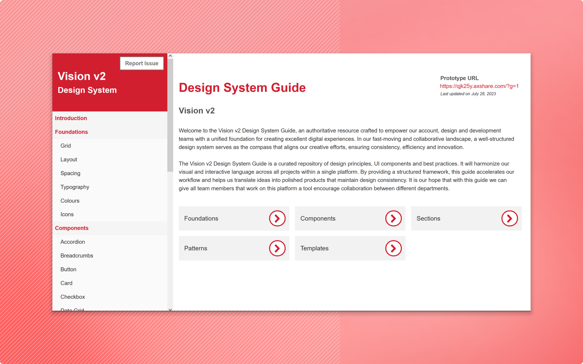
Vision Design System: A Strategic Guide to Consistency and Growth
Vision Design System is a definitive resource that provides our business, design, and development teams with a cohesive foundation for delivering outstanding digital experiences.
My Role
I led the development of the Vision Design Guide, under the guidance of the Design Lead. I set up the framework and processes to create a strong design system that meets the needs of developers, product owners, and the design team.
Timeline
2023 - 2024
Team
UX Designer (Me) & Design Lead
Scope
Stakeholder interviews, Design review, Accessibility evaluation, Define Principles & Guidelines, Design Library, Feedback interview

Opportunity
We have an opportunity to perform a comprehensive overhaul to enhance the design system and resolve the current issues. This approach will not only address the existing problems but also equip the system to manage future challenges and risks.
Approach
I dedicated considerable time to reviewing existing design artifacts, analyzing various apps within the platform, understanding developers' pain points, and exploring publicly available design systems. This thorough approach helped me establish design foundations tailored to the specific needs of the apps in scope.With these foundations, I documented all essential elements of the design guide, developed reusable components, gathered feedback to refine the documentation, and set up guidelines for ongoing updates.
Retrospect
Meetings with project, development, and design teams to identify gaps and opportunities.
Design Audit & Problem Definition
Perform a detailed audit of the current design system to identify gaps and inconsistencies.
Define Foundations
Define core design principles that guide all design decisions, ensuring consistency and coherence.
Design
Meetings with project, development, and design teams to identify gaps and opportunities.
Documention
Perform a detailed audit of the current design system to identify gaps and inconsistencies.
Review & Iterate
Define core design principles that guide all design decisions, ensuring consistency and coherence.
Retrospect
Conduct structured sessions with Developers and the Project team. Focussed on following three questions.
Interview Context
I led discussions with the Developers and Project team, focusing primarily on the following topics:
How would you rate the ease of use of the app?
How would you evaluate the overall design aesthetics?
What additional information or assets could efficiency?
Response Themes
A highlight of few of the responses.
"There are too many actions, and I often get confused about where to find information."
"The app feels a bit clunky to me, and the tables are busy and hard to read."
"I'm having trouble styling the components and getting all the details from the wireframes."
Design Audit
Wireframe Review
Examined structure and organization of sections across screens.
Analyzed wireframes to identify recurring layouts, patterns, components, and design elements.
Recognized design elements like typography, colors, and iconography used throughout.
Market Research
Reviewed Design Systems focussed on complex Web Applications.
Documented best practices and process to adopt to Vision Design Guide
Problem Definition
Based on the insights I gathered from the retrospective meetings and audit, I categorized data points and identified the top three themes, to prioritize these themes for the design guide documentation.
Consistency
Standardize design elements to ensure a uniform look and feel across all components and applications.
Documentation
Build the system with flexibility in mind, allowing easy addition of new features and components.
Scalability
Enhance the design system to support a growing number of components and features without compromising its utility.
Design Foundations
Defined shared rules and principles to provide a strong basis for consistency and cohesiveness across different applications on this platform. From the precise alignment of the grid system, the standard spacing rules between elements or the wide selection of typography, colour and icons, each page in this section serves as a fundamental building block for our design system.
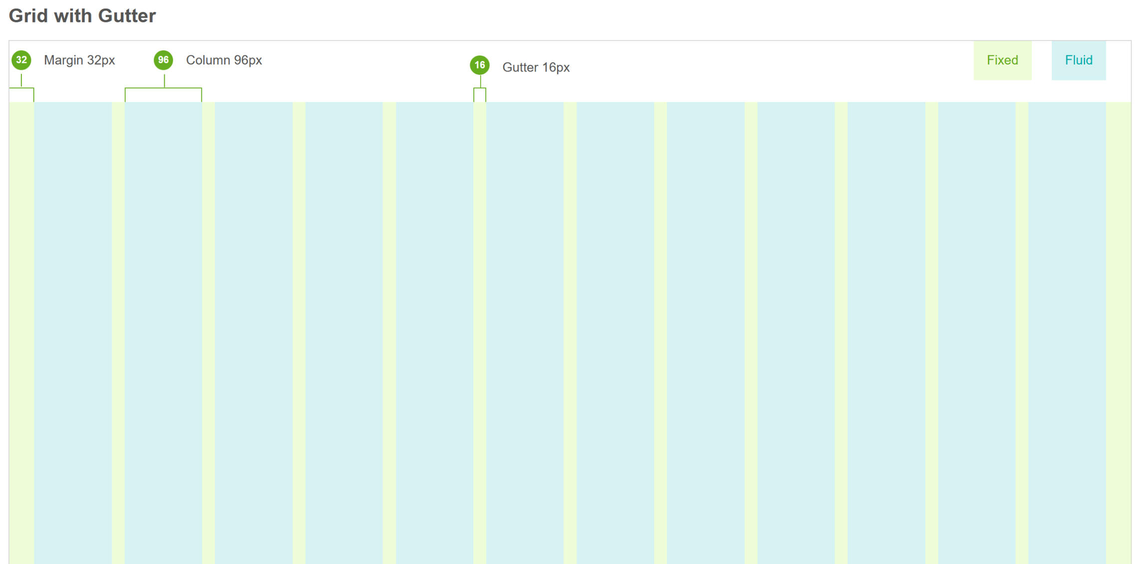
Grid
Used Columns and rows to establish key lines that create a visual rhythm in the design. I created columns by dividing the space into a fluid grid or by arranging fixed boxes in multiples.
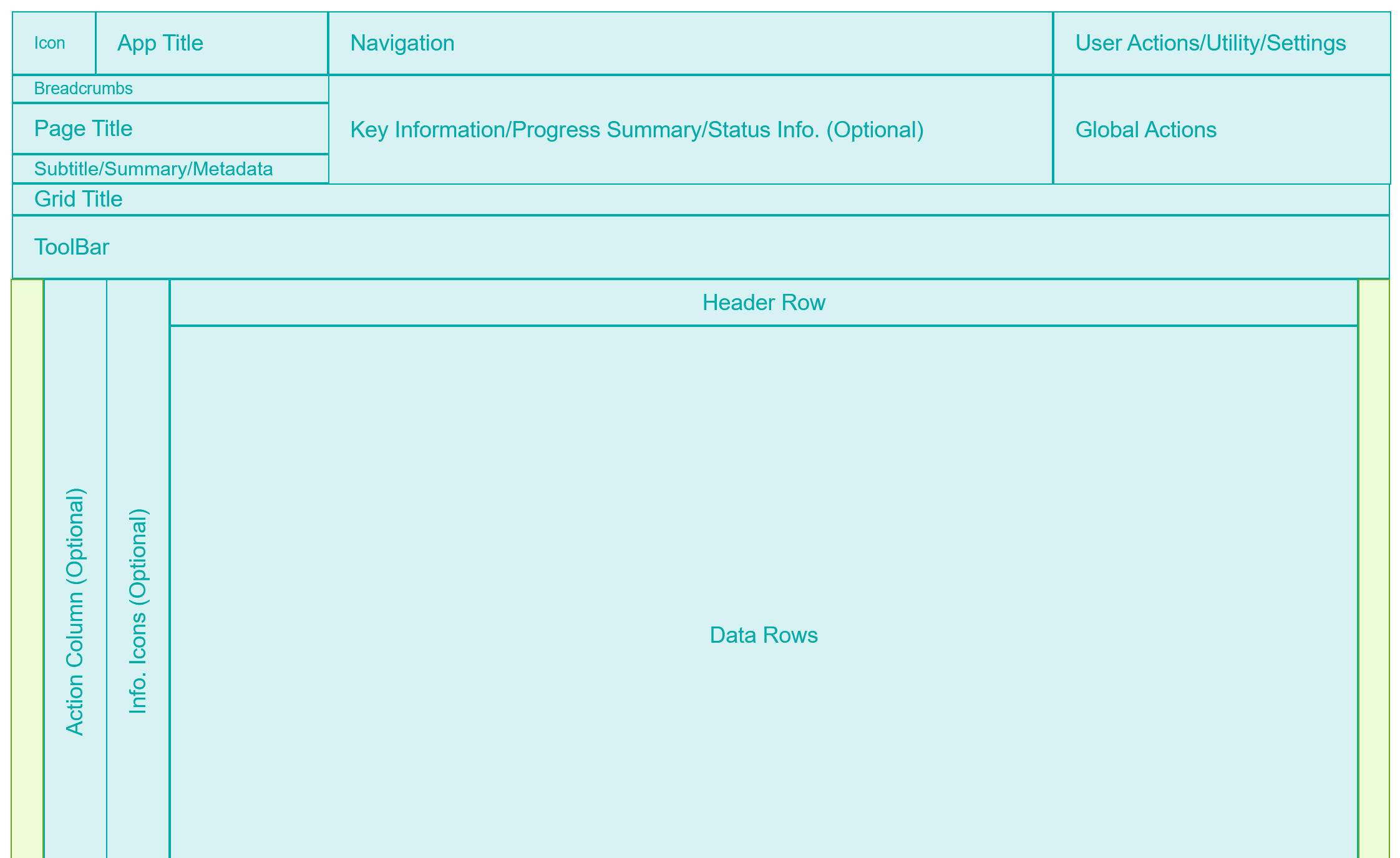
Layout
I designed flexible app layouts that clearly defined key sections, such as Navigation, Action areas, and the Grid System. I also provided recommendations for content placement that followed a consistent hierarchy and familiar patterns to ensure an intuitive and user-friendly experience.
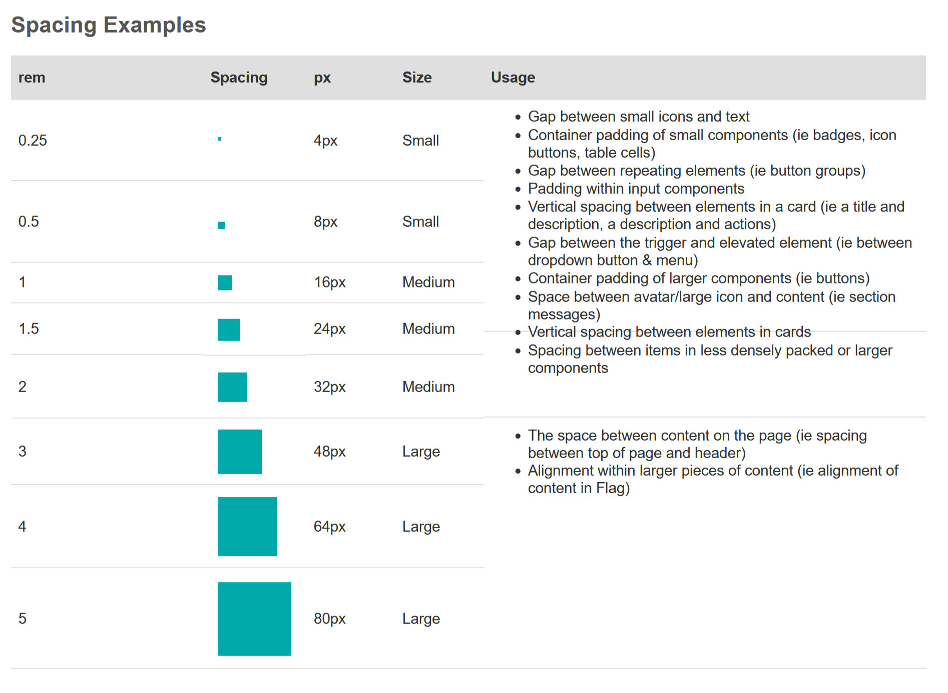
Spacing
Spacing system is built around a base unit of 8 pixels. This base unit determines the spacing scale and ensures visual consistency across platform.
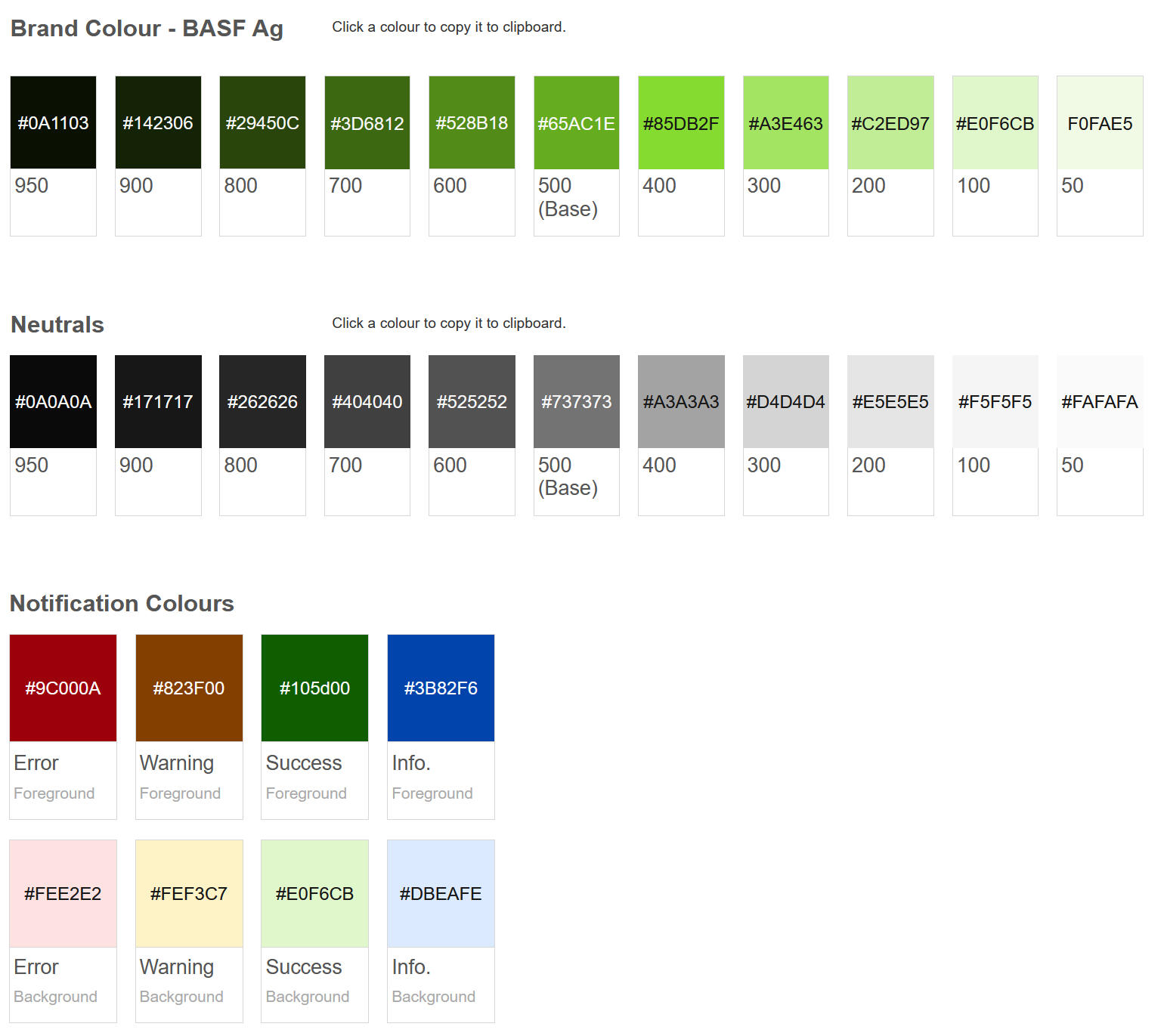
Colour
I used the brand color as the primary color to reinforce branding and highlight key elements on the page. A neutral gray was selected as the secondary color for more frequent use throughout the app, providing a balanced backdrop. Semantic colors were designated for notifications, alerts, and other status indicators to enhance functionality. I also ensured that all colors met WCAG accessibility guidelines for optimal readability and inclusivity.
Typography
Established simple and clear typography guidelines that are accessible, and visually aligned with the overall brand identity.
Iconography
Identified icons required for Data-intensive web applications and referred to Kendo UI Icons. Created a Icon Library, that can be used across a range of projects.
Design Library
Established common rules and principles to ensure consistency and cohesion across applications on the platform. Each page in this section, from grid alignment and spacing rules to typography, color, and icon choices, forms a key building block of our design system.
Defined page structure for consistency.
Identified & documented relevant components to use.
Gathered feedback, reviewed, and updated designs.
Designed reusable components for efficiency.
Established a process for quick prototyping.
Structure
Outlined the contents of the design system to meet the specific needs of projects.
Component Guidelines
I established a comprehensive structure for component guidelines that covered all necessary aspects, both mandatory and optional. This approach enabled us to document a consistent and easy-to-understand design system.
Reusable Components
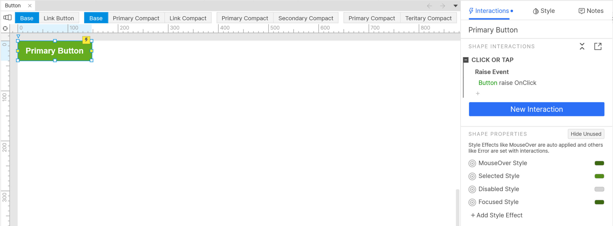
By fully utilizing the capabilities of Axure, I developed a comprehensive design toolkit that included everything from basic styling and style effects to various interactions and component variations.
Review & Iterate
By collecting feedback from users and stakeholders, we can continually refine and improve the design system. This process involves updating components, refining guidelines, and adding new best practices to ensure everything stays consistent, user-friendly, and scalable across various platforms. This ongoing approach helps the design system stay flexible and effective, keeping up with changing user needs and business goals.
Retrospection
Reflecting on the entire project with the design team, we identified several areas for improvement:
Prioritizing Design Tokens: Implement design tokens from the early stages to define visual attributes, ensuring seamless communication and consistency across platforms. This will be our top priority for the next iteration.
Revisiting Grid Definitions: Some grid definitions were found to be impractical for future projects, particularly when it comes to data grids. Certain rules negatively impacted page performance and need to be refined.
Enhancing Component Flexibility: Improve the flexibility of reusable components to eliminate the need for breaking instances when making design adjustments, streamlining the design process and enhancing efficiency.
Outcomes
Based on the insights I gathered from the retrospective meetings and audit, I categorized data points and identified the top three themes, to prioritize these themes for the design guide documentation.
Development Framework Alignment
By adapting to and referencing the Kendo Framework, I ensured that the design and development processes were aligned and worked seamlessly together.
Enhanced Consistency
The unified set of guidelines and standards ensures consistency across all projects and platforms. This consistency helped in creating a cohesive user experience
Design Efficiency
By having a comprehensive set of components, templates, and guidelines readily available, design and development teams could work more efficiently.
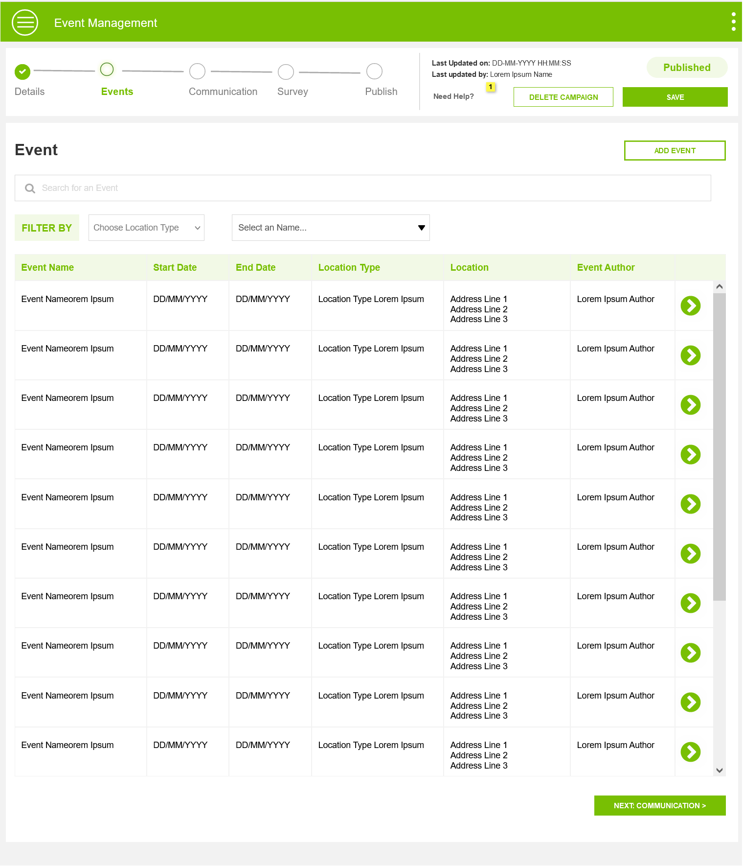
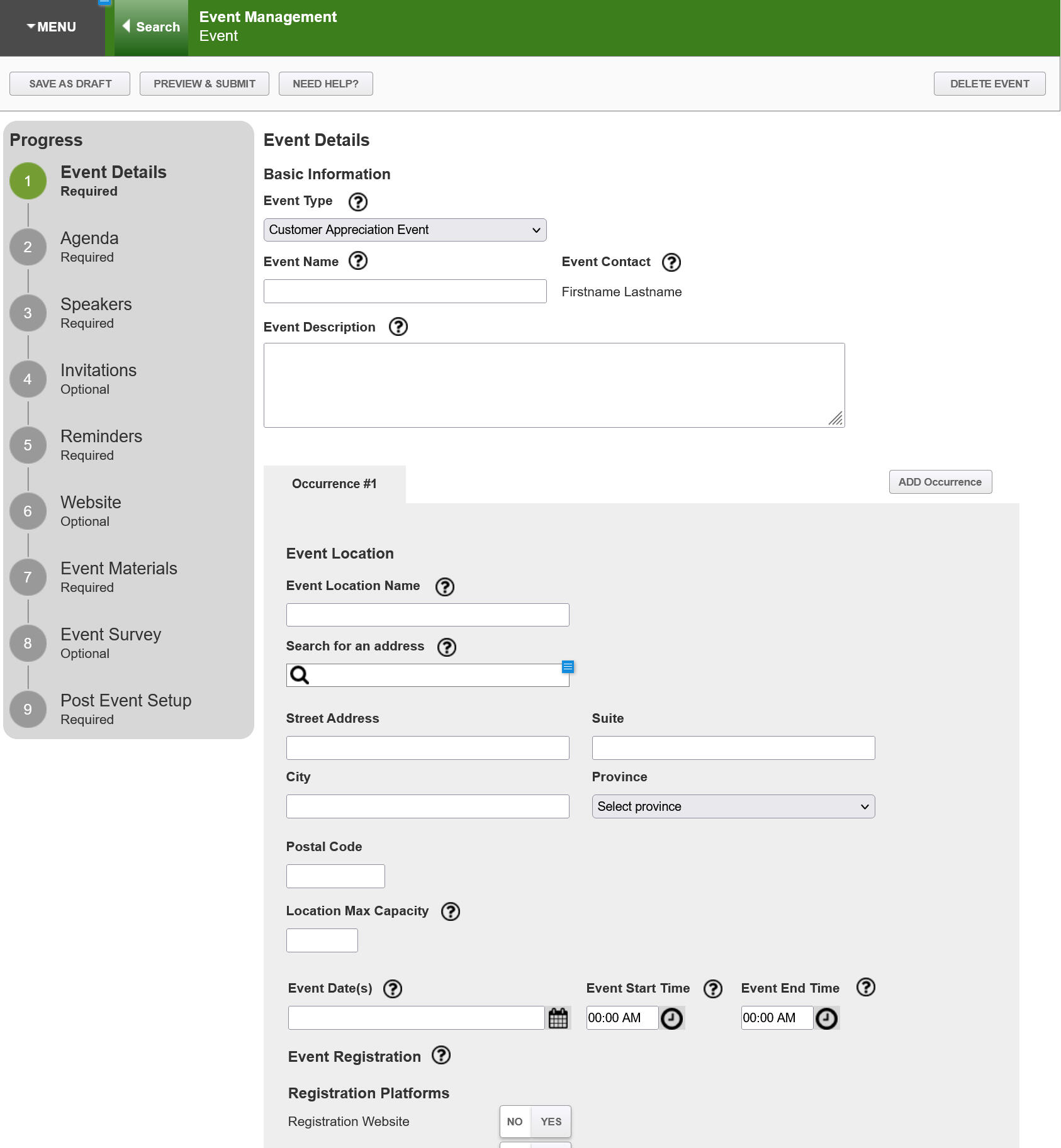
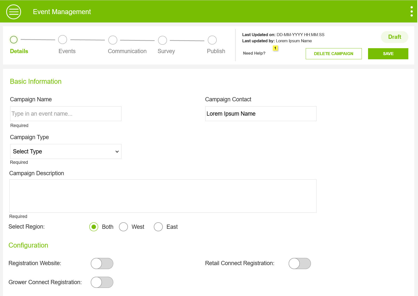
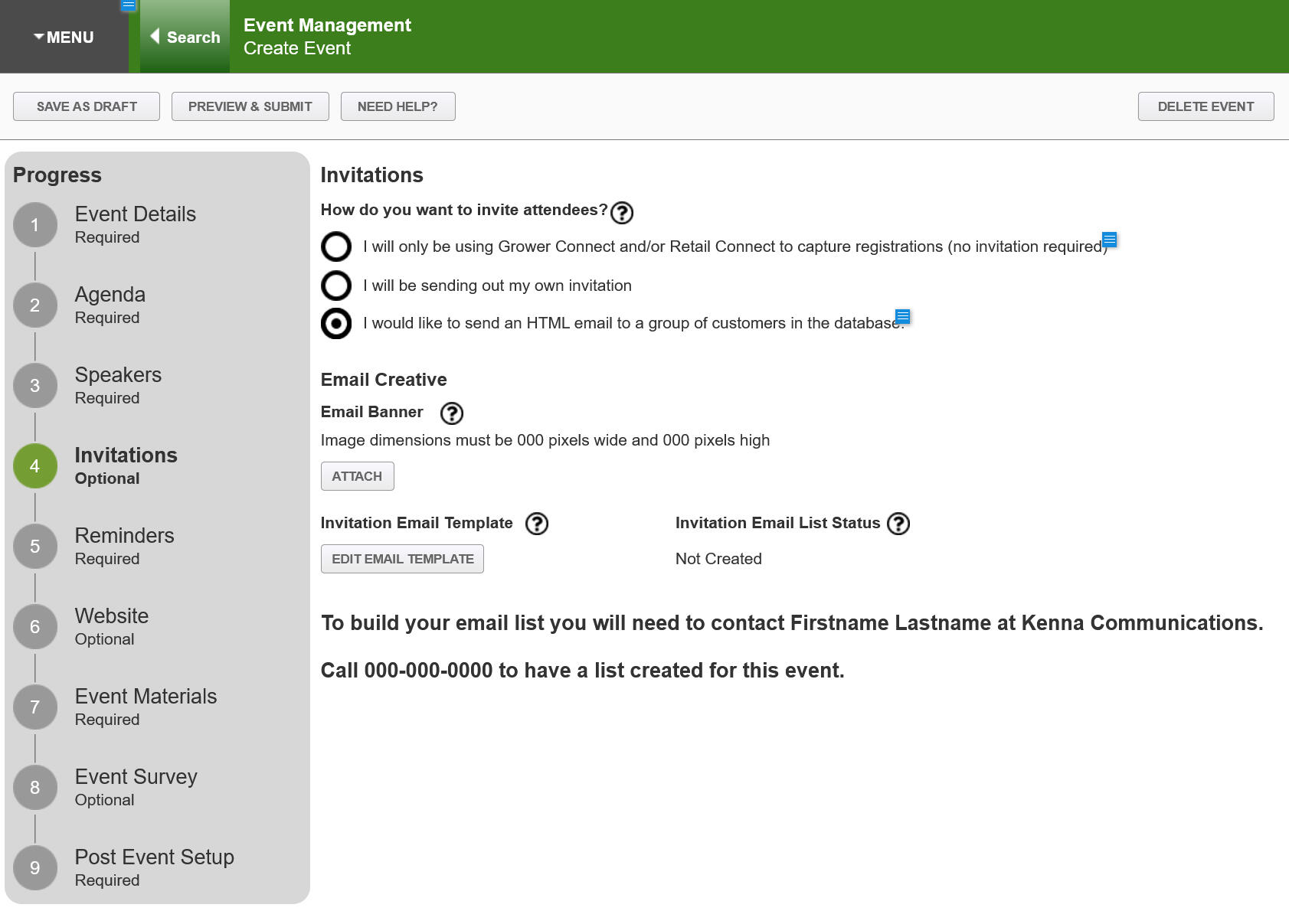
Redesigning the Event Management Journey from Start to Finish
An event management system to manage Farmer related events across Canada.
My Role
I redesigned the Internal Event Management System under the guidance of the Design Lead. This project aimed to address user feedback, align business goals with user needs, and enhance the overall user experience wherever possible.
Timeline
Feb 2023 - Apr 2023
Team
UX Designer (Me) & Design Lead
Scope
Requirement Analysis, Design & Stakeholder Review, Market Research, User Flows, Information Architecture, Wireframes & Prototypes.
Understanding the problem
The first version of the Event Management tool was launched in 2019, the responsive web app was majorly used by two users - admin and reps. While we had collected general feedback over a period of time on the user experience. I organized further brainstorming sessions with Product Owners and Admin, who frequently help Reps with maneuvering the tool. The focus of these sessions was on these three aspects.
Impediments
"Where did Users get stuck and what they did do to overcome the challenges to complete their task"
Workflow
"Walk us through your typical process with the existing tool"
Emotion
"How do you feel using the the event management platform"
Feedback from different user Groups
Sales Reps
Multiple instances of the same events were created across locations, a huge duplication of effort.
We ended up creating overlapping Events thus distributing participation
Some Event locations are not Laptop friendly.
The Training was good, but in due course, we got stuck frequently.
Admin
Reps found it super difficult to create an event without the help of the product owner.
For each Event, they had to touch base with the Creative team for emailers and this was time-consuming.
Simplify the event creation process
Business
Business uttered the magic words "We have the budget and time, so lets do a rebuild to address the User Expereince and Business process issues"
Developers
Dev Lead let us know that they would be building the app in React and predominantly using Kendo React components, so if you could leverage the features of this framework it would help speed up the development process.
Opportunity
Rethink the Information Architecture & User Flow to address Workflow issues
Design a framework that offers flexibility to customize in the future and simplifies workflow with reusable components and insights.
Design an IPad friendly app that helps Reps check-in participants on the go at a farm or an Auditorium
Identified Kendo UI components that would improve the experience of Event Creation like Typeahead search, scheduler components
Research & Analysis
I approached research with the goal of finding answers to three questions that would define the design of Event Management tool.
How the Industry leaders do it?
Analyzed a range of tools to understand the workflow and features they offered. TO name a few Eventbrite, Meetup Typeform, and JotForm events to understand how these products work and how they handle edge cases.
Likes and dislikes of the existing app
Analyzed the existing app to find what's good to retain and what can be scrapped. Also had a further round of brainstorming sessions with Reps and admin to understand what pieces of the app they like and hate.
What is possible?
Understood the capabilities of the Kendo UI Framework and React Framework and this helped me ensure that my designs were technically feasible.
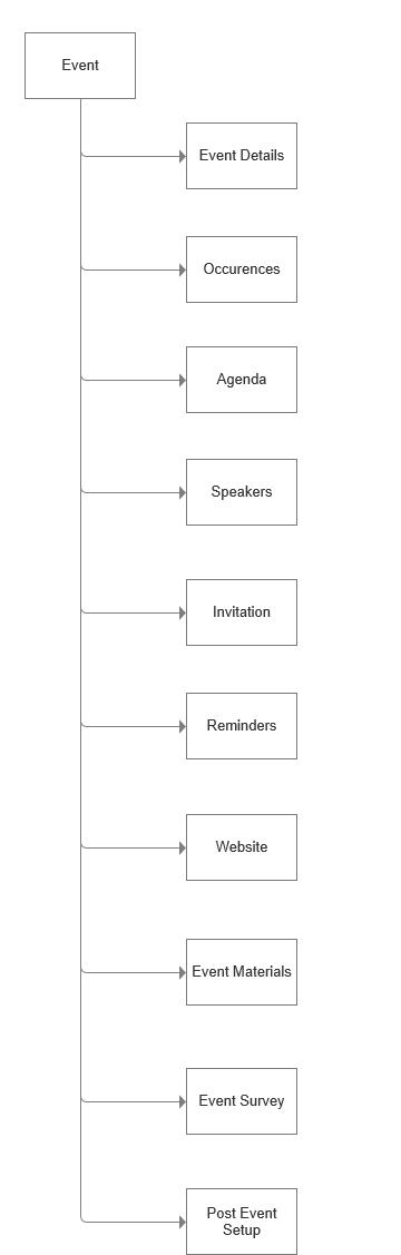
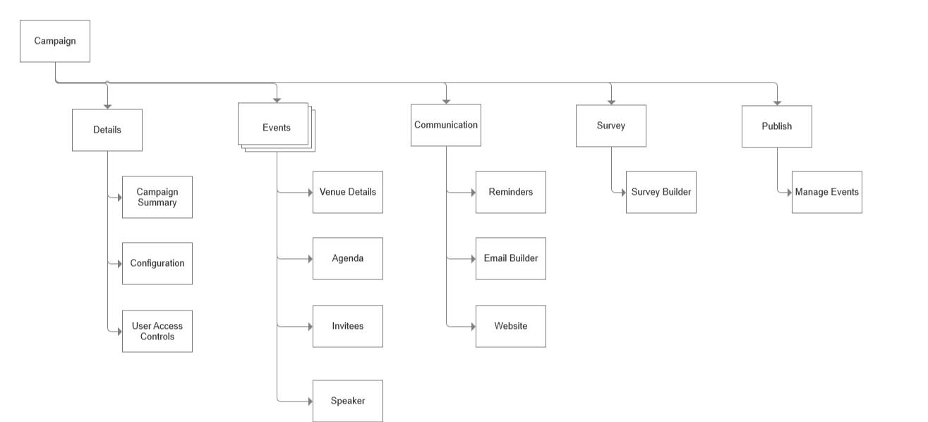
Information Architecture
Analyzed the existing app to find what's good to retain and what can be scrapped. Also had a further round of brainstorming sessions with Reps and admin to understand what pieces of the app they like and hate.
Before
Sequential update of the information
Taxonomy was confusing
Extensive and Confusing Process
After
Grouping similar sections offered clarity and structure to Campaigns
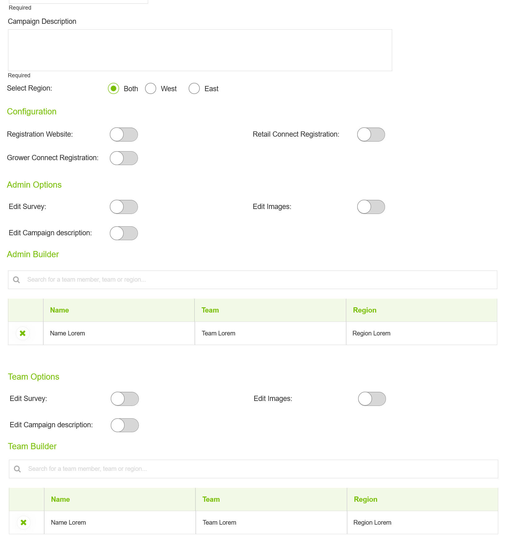
Configuration and Access mgmt provided flexibility to manage different types of campaigns
Update information as and when available.
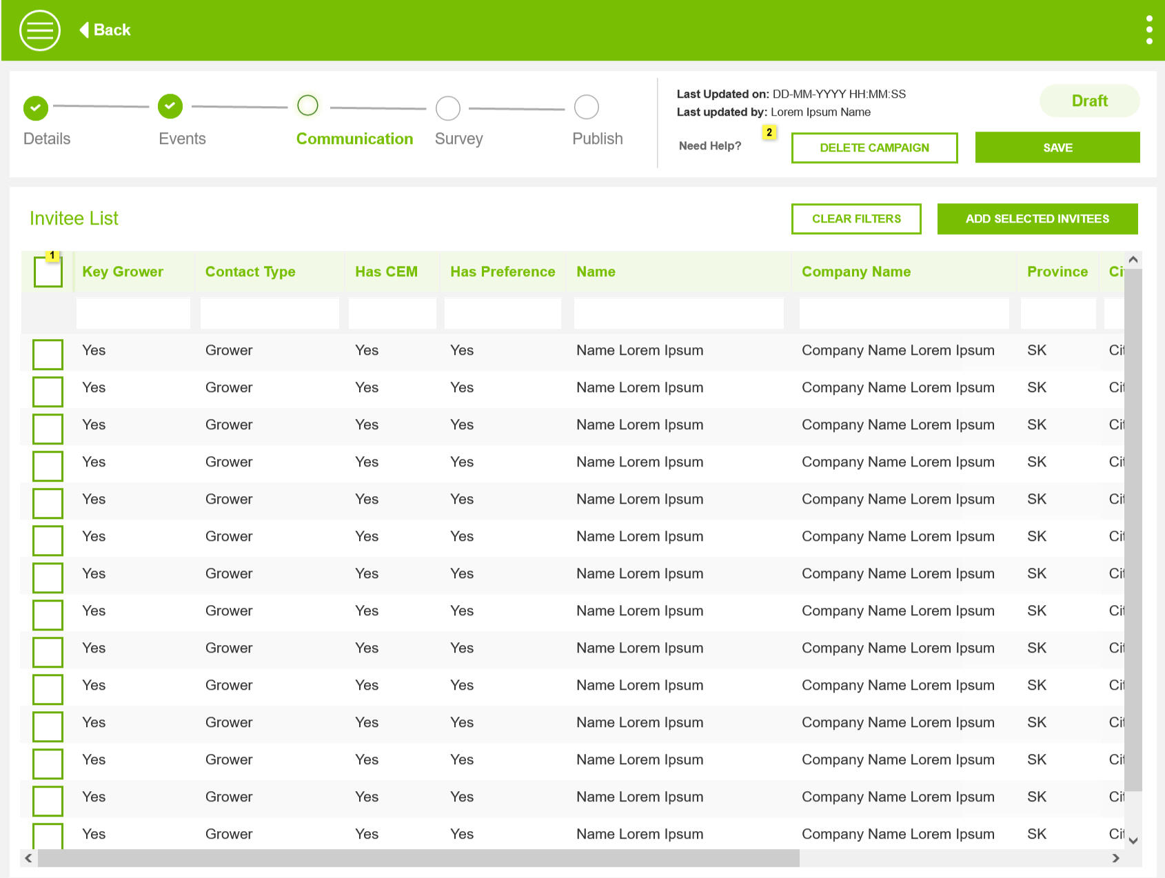
Eliminating repetition by mapping Communication, Survey and Generic details to the campaign. While Events are specific to its location and availability.
The Wireframing Process
Our Design Team has pre-built Design and Branding Guidelines. And considering the short window for an extensive app, I skimmed my wireframing process from Rough scribbling of ideas on paper to Hi-Fi prototypes.
Solution
I went to the basics to take my mind away from the existing product and how I would built it to address the problems.
Grouped Events
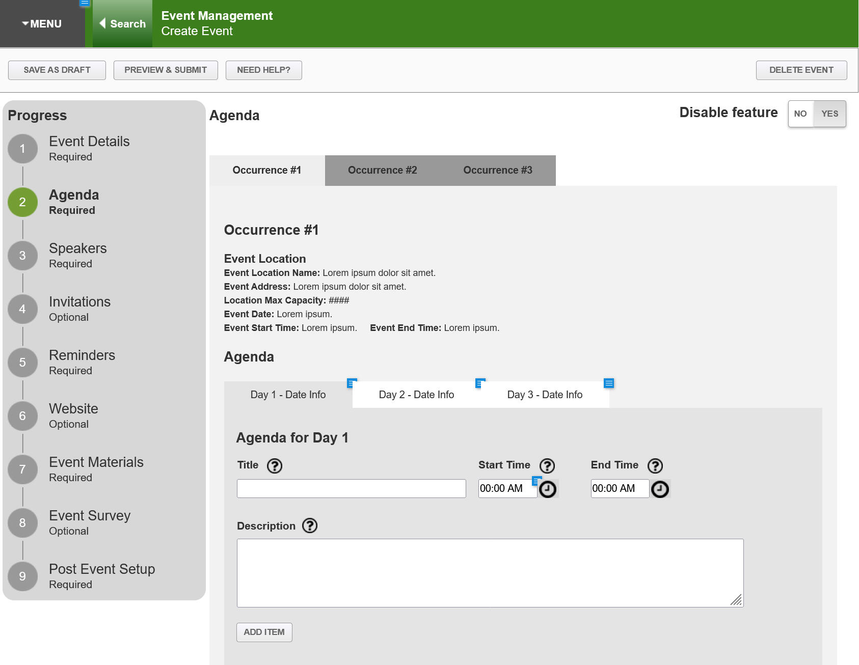
Rethinking the Information Architecture. A single Campaign will hold multiple events.
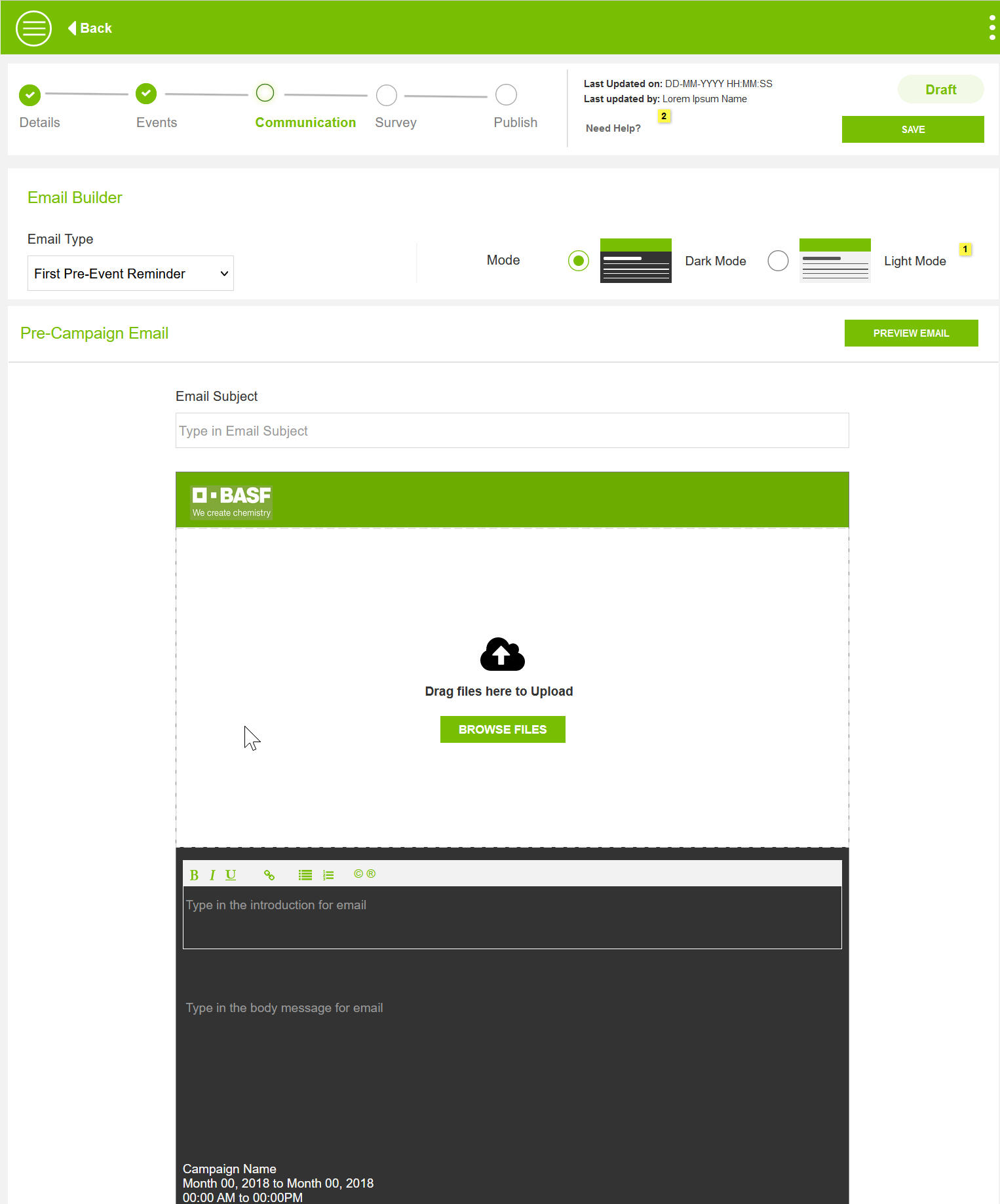
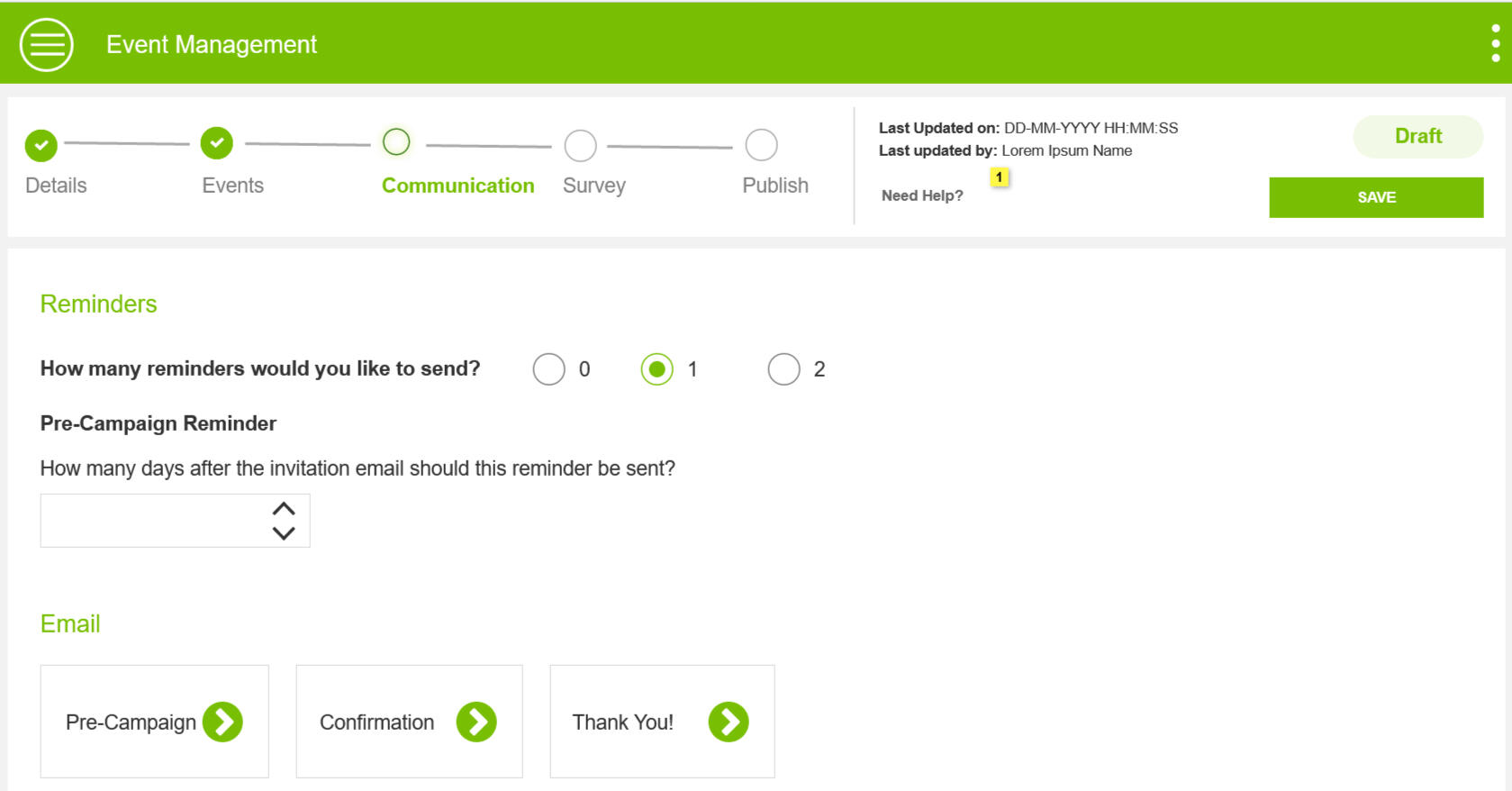
Email Builder
By analyzing emails sent in the past years, I defined the email templates and options to set the frequency with simple clicks.
Survey Builder
Robust survey builder with the ability to duplicate, and reorder, the four most commonly used question types by Reps.
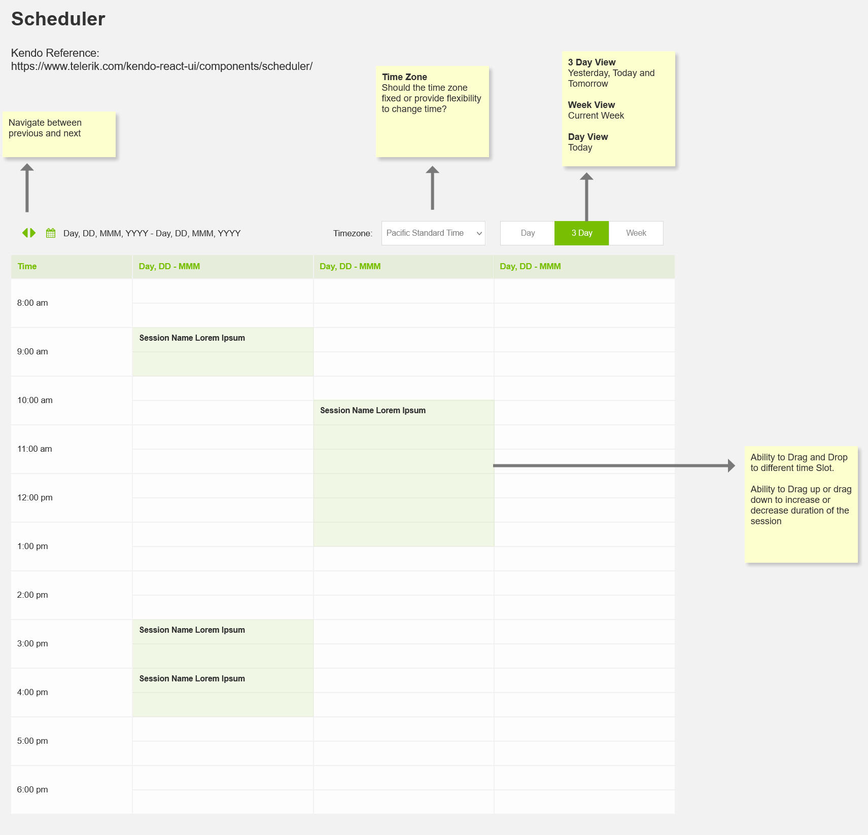
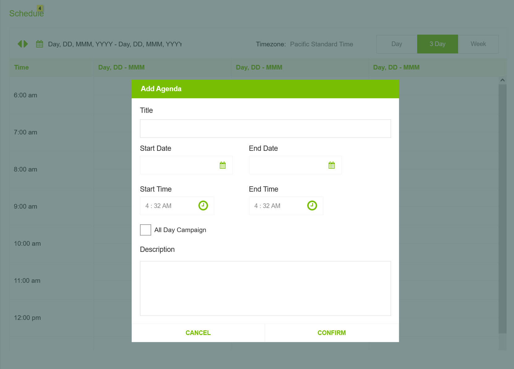
Scheduler
Scheduler helped Reps create events that doesn't overlap.
Easy to Customize
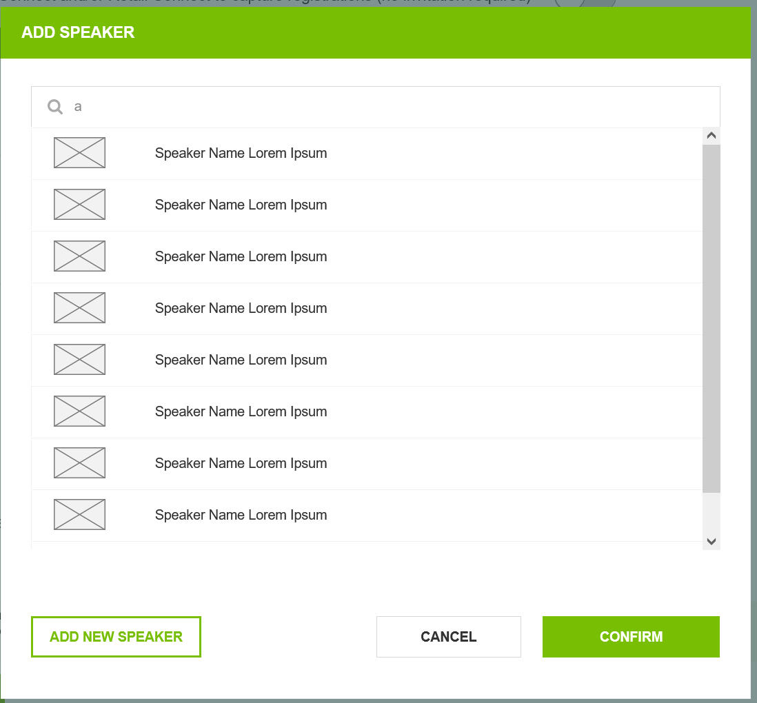
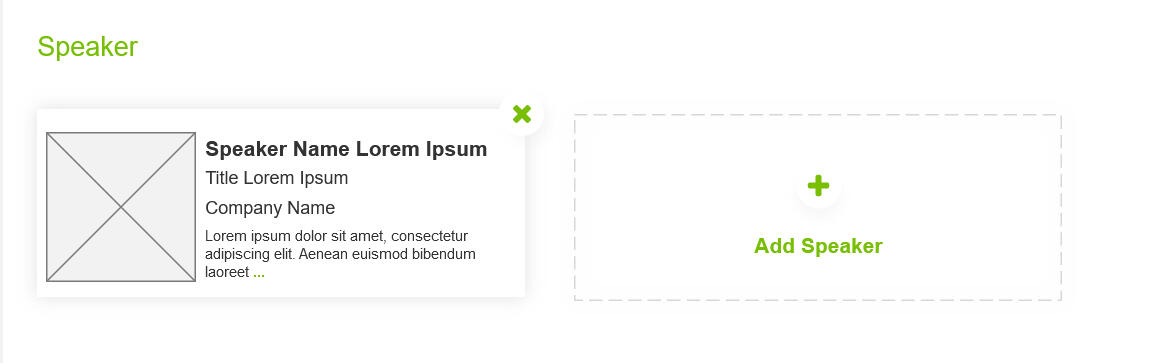
Framework-driven and reusable data pieces was the focus. This enabled built a highly customizable event management tool. One such example is Speakers
Access Management
Robust User Access Management feature meant who could see what campaign and what they could modify.
Easy to Customize
Integrating Check In process into the workflow and making an Ipad friend version of the app to eased Check-in and Follow Up.
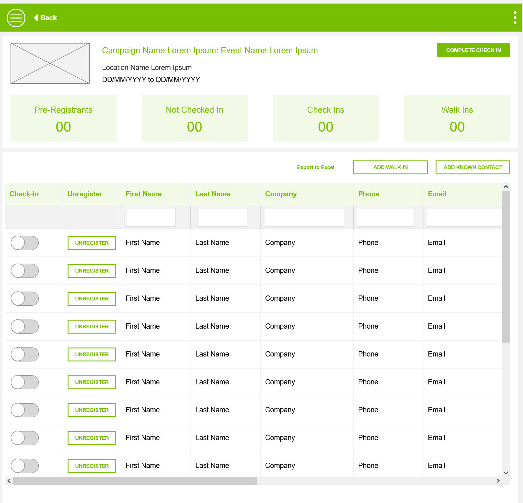
User Testing and Feedback
Creating an event is a long and tedious process
Before
Creating an event is a long and tedious process
Users had to go through a 9 step sequential process to create an event
Users often got stuck because the information was not readily available.
Reps were entirely dependent for Product Owner to assist them in filling lengthy forms.
After
Creating an event is a long and tedious process
I refreshed the User Journey of an Event Creation to a simple 5 step flexible process.
5 Step process with a clear indication of what's complete, what's next, and what's pending helped Reps work independently on creating events.
Ability to jump between sections meant Reps updated information when available, helping them progress as they gathered information.
Before
Inviting participants was happening in external systems.
After creating events, Users had to invite participants using another tool.
Tedious and time consuming to switch between apps to complete a simple process
Attendees of an event were not tracked in the App, Business was missing out on valuable information.
After
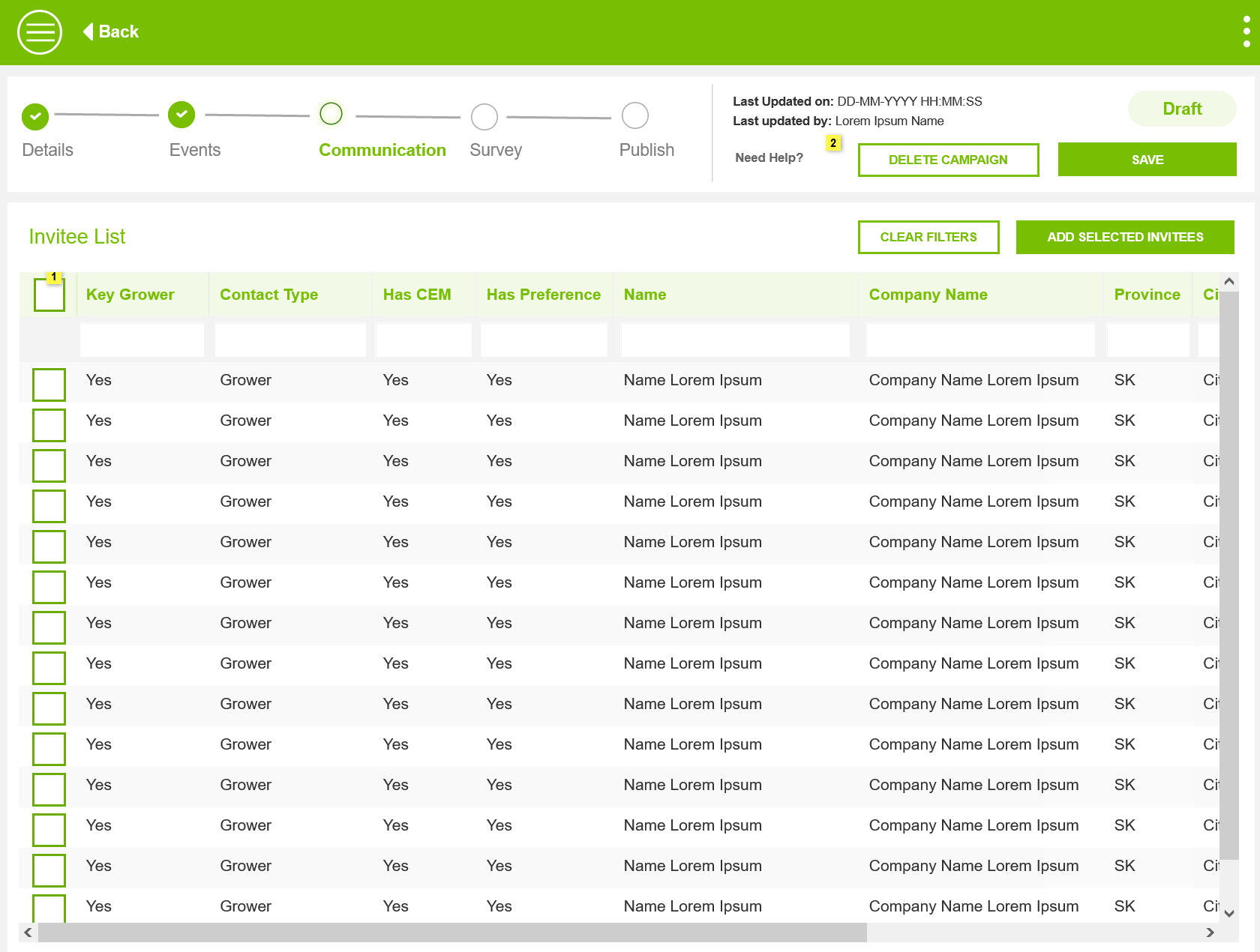
Inviting participants is now an in-app feature
Recommended an API call to the Grower and Retailer Database so that participants can be invited to specific events.
Selectable Grid to help Organizers invite relevant participants
Showing PIPEDA status to ensure emails are sent to subscribed participants only.
Before
Similar Events with overlapping agenda
Each event was created in silos, this introduced multiple challenges.
Overlapping events created for the same location by different Reps
Similar events were created by different Reps, causing duplication of effort.
After
Scheduler component to manage Agenda & events
Clarity while creating events.
Removed duplication of effort
Outcomes
Addressing User Feedback and leveraging new technology to design a flexible and robust System helped improve the overall Event Management process and offering a number of benefits.
Insightful
Managing the entire Grower Journey in one app provided valuable insights into business
Customizable
Framework focussed design allowed the business to quickly add Virtual Event Type to address Covid Issues
End to End Process
Integrating Offline activities like Check in helped Reps by saving time and helped business react to Covid 19 Challenges.
Managing Blocked Users across platform with a effective solution
Enhance the Flagging users process to introduce additional rules to manage fraudulent users.
My Role
I delivered a design solution and guidelines by collaborating with product owners and developers. My role was to create a flexible and efficient solution that could be seamlessly implemented across multiple platforms with minimal disruption.

Timeline
2 Weeks, June 2024
Team
UX Designer(Me)
Scope of Work
Requirement Analysis, Stakeholder Interviews, Product Audit, Impact Analysis, Wireframes, Solution Guide
Challenge
The challenge was to ensure that flagged users were effectively blocked from accessing systems and data while preventing any communication. This involved restructuring existing user data to incorporate the new flag, updating the system to manage workflows for blocked users, and guiding business users on how to handle these individuals effectively.
Minimum System Impact
The proposed solution should minimize impact on existing applications and workflows while being easy to implement across systems.
Robust Solution
The solution must be compatible with multiple platforms and technologies, allowing for seamless integration with existing workflows. It should ensure efficient updates and maintenance without disrupting ongoing operations.
Feasible Implementation
It should fit within the existing constraints of the system. By addressing technical and operational challenges, the solution must be effectively integrated and maintained within the current product environment.
Design Process
In my design process, I begin by understanding the problem and gathering insights from stakeholders. I identify workflow patterns and create reusable solutions. Throughout, I incorporate feedback to ensure alignment with user needs and business goals, focusing on practical implementation to deliver effective solutions.
Stakeholder Interview
I conducted stakeholder interviews and product walkthroughs to understand user flows and touchpoints, gathering insights to guide the design in line with user and business objectives.
Impact Analysis
I reviewed 10+ apps and 100+ screens, using input from product owners to identify impact areas and updates. I documented findings and analyzed common patterns across screens and flows.
Exploration
Based on the recurring patterns, I examined internal apps and data-intensive design systems to identify potential solutions.
Prototyping
I designed reusable solutions, tested them in various apps, and adjusted styling and behavior to meet technical and layout constraints.
Design Review & Feedback
I conducted design reviews to gather feedback from stakeholders and users. This process helped refine the design, ensuring it met user needs and aligned with project goals.
Solution Guide
The design solutions guide offers actionable guidelines for implementing effective designs, ensuring consistency and usability across projects.
Stakeholder Interviews
I conducted stakeholder interviews and product walkthroughs to understand the application, user flows, and touchpoints. This helps me gather insights into needs and expectations, guiding the design of solutions that align with user and business objectives.
🔍 Application Walkthrough and Business Requirements review
🗂️ Identifying Touchpoints & Key Workflows
🎯 Understanding Expectations of the Business
Impact Analysis
I reviewed 10+ apps and 100+ screens to identify impact areas and necessary updates, using input from product owners to focus the analysis. I documented findings and analyzed common flows and screens to uncover recurring patterns.
Risk Assesment
The client needed an urgent implementation, which initially suggested quick and potentially substandard solutions. However, it was possible to deliver a solution that was both fast and effective if standard design principles were maintained.
Responsive Applications
Ensuring that the solution works effectively across different devices and screen sizes.
Missed Workflows
Potentially overlooking some applications or workflows that might be crucial for the overall system
Solution Approach
The proposed solution involved adding a layer on top of the existing system to integrate the new functionality.
Exploration
Coordinate with Developer Leads to obtain technical insights about the framework. Analyze screenshots to spot common patterns and leverage this information to identify viable solutions. Document the findings and collect feedback, with a focus on flags, toast messages, alerts, overlays, and inline messages as possible solutions.
Challenges
📆 Application developed 6-7 years back with an older technology.
⏰ Designing for all applications wasn’t feasible, so we needed a new approach.
Recurring User Flows
Common user flows across platforms and applications were identified. By focusing on these flows, all potential blocked user touchpoints can be effectively addressed.
Viewing primary user information
Viewing related user data
Editing user information or data
Identifying a blocked user
Accessing blocked user data
Restricting user access to client information or data
Providing application users with clear reasons for blocked status
Prototyping
I developed reusable solutions for identified patterns and tested them across various apps. I fine-tuned the styling and behavior to accommodate technical, space, and layout constraints. This phase of the project was managed in three key steps.
Generic Solutions
I added generic User Flows and reusable design components. The focus was to keep details at high level. Ensured that styling was kept minimal to blend along with different app styles.
Prototyping Key Workflows
Applied the genric solution to specific user flows in application to identify any friction and ensure the user experience was seamless.
Designing for Excepections
Designed specific design solutions for exception scenarios. It was mostly reusing some of the design components but with customized solutions for exception scenarios.
Solution
The design solution emphasized reusability, ensuring quick, consistent, and cost-effective delivery. By focusing on reusing components and styling, along with leveraging application screenshots, This approach helped us meet the tight deadlines.
General Rules
Guiding principles of Solutions to improve the overall user experiences.
All Blocked User information will be read-only. Edits are not allowed unless there is a business rule.
Guide Users and keep them informed with helpful messaging, supporting information and text.
Any Create action for a blocked user will not be available.
Work Flow progression actions will not be shown for Blocked User.
Blocked Flag is mapped to User Data, and displayed along with User info.
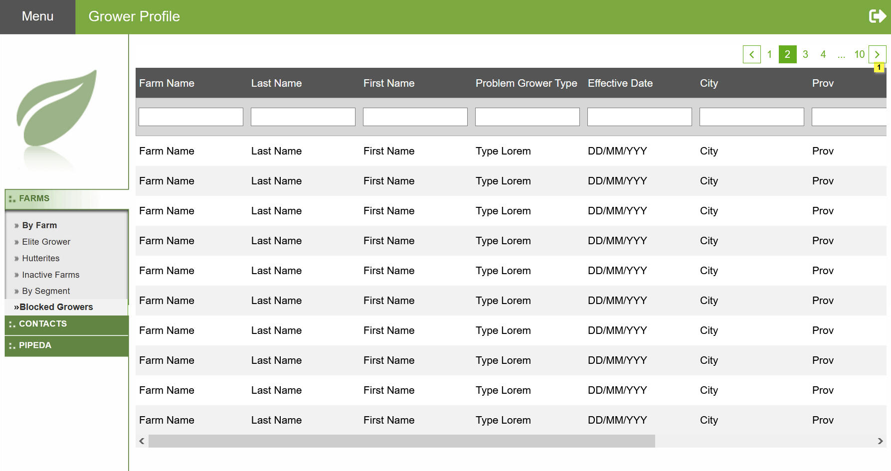
New Screen for Blocked Users
Designing a new screen for blocked users involved addressing specific user needs and providing a clear, helpful message when a user encounters restrictions.
Impacted Sections & Steps of the User Flow
Another outcome of the application walkthrough and the application audit was a common theme where User views or modifies Blocked User Data. 5 Key sections of the app was repeated user to show or modified User Data.
Nav Bar
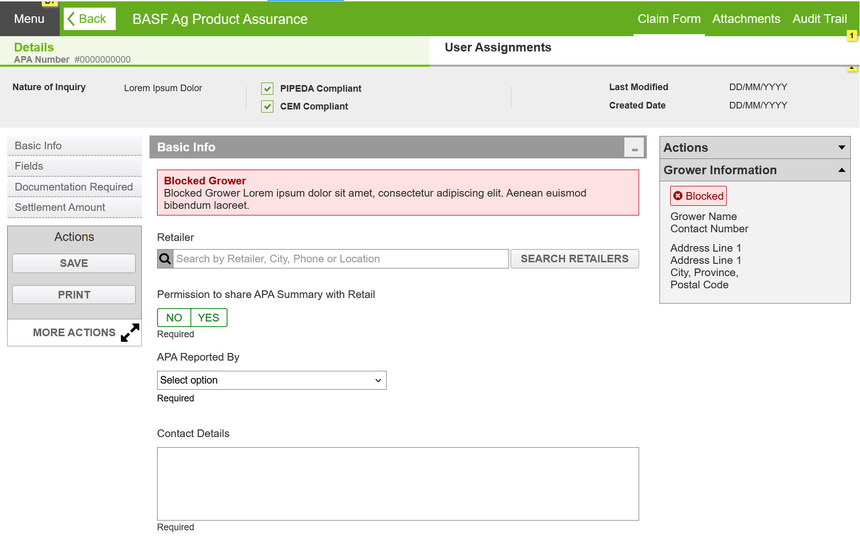
Blocked Flag will be displayed along with the User Information in the Top Nav bar.
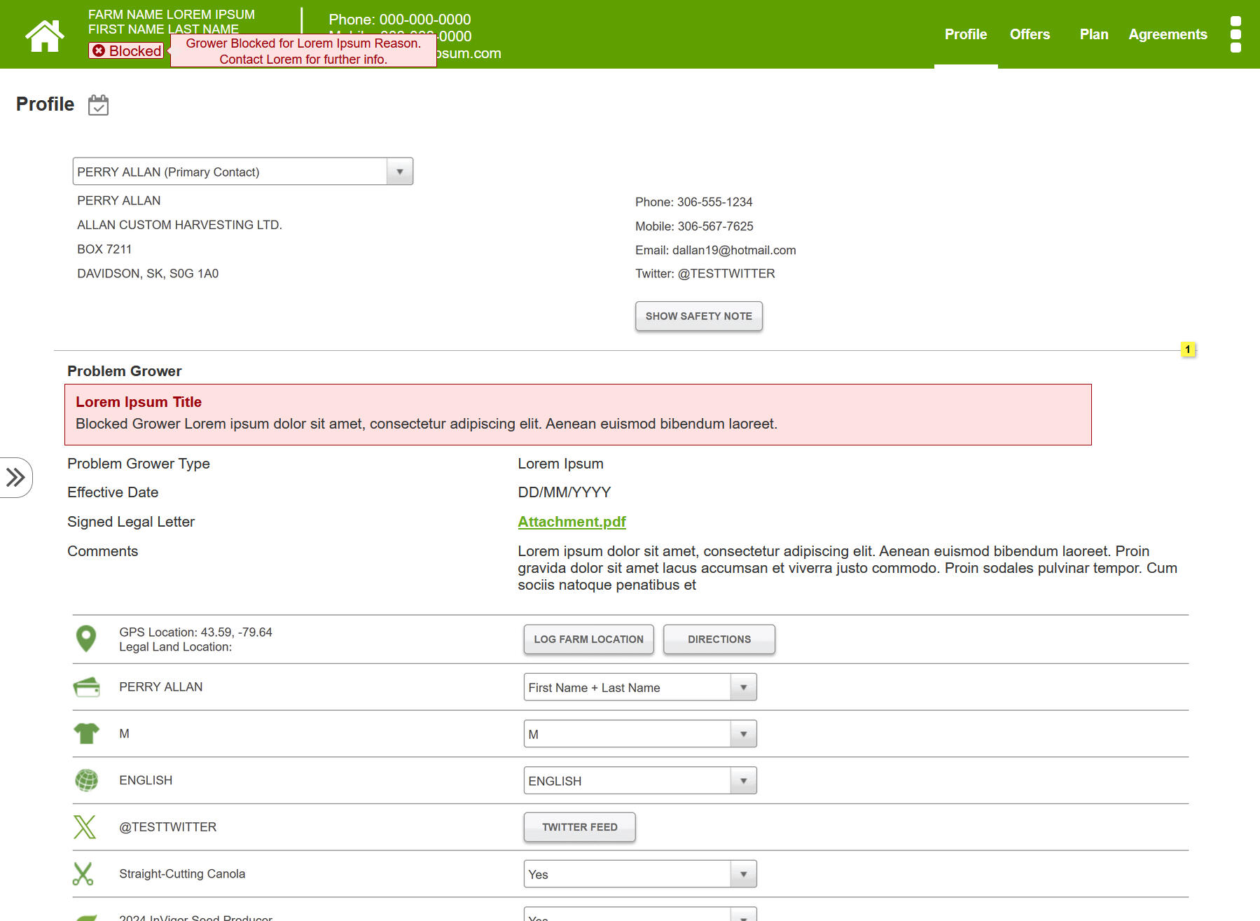
Form Page
A Banner message will be displayed to provide details of the Blocked User Profile. Additionally, where Farm Basic information is displayed a blocked flag is shown.
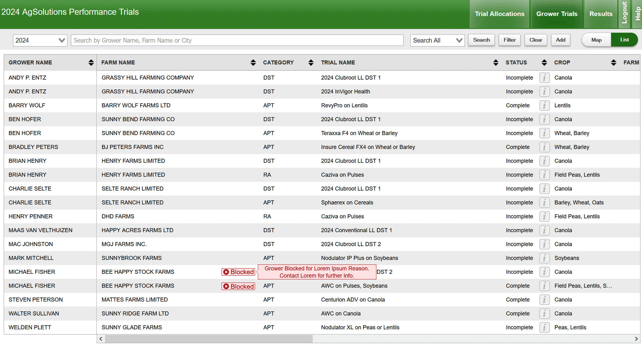
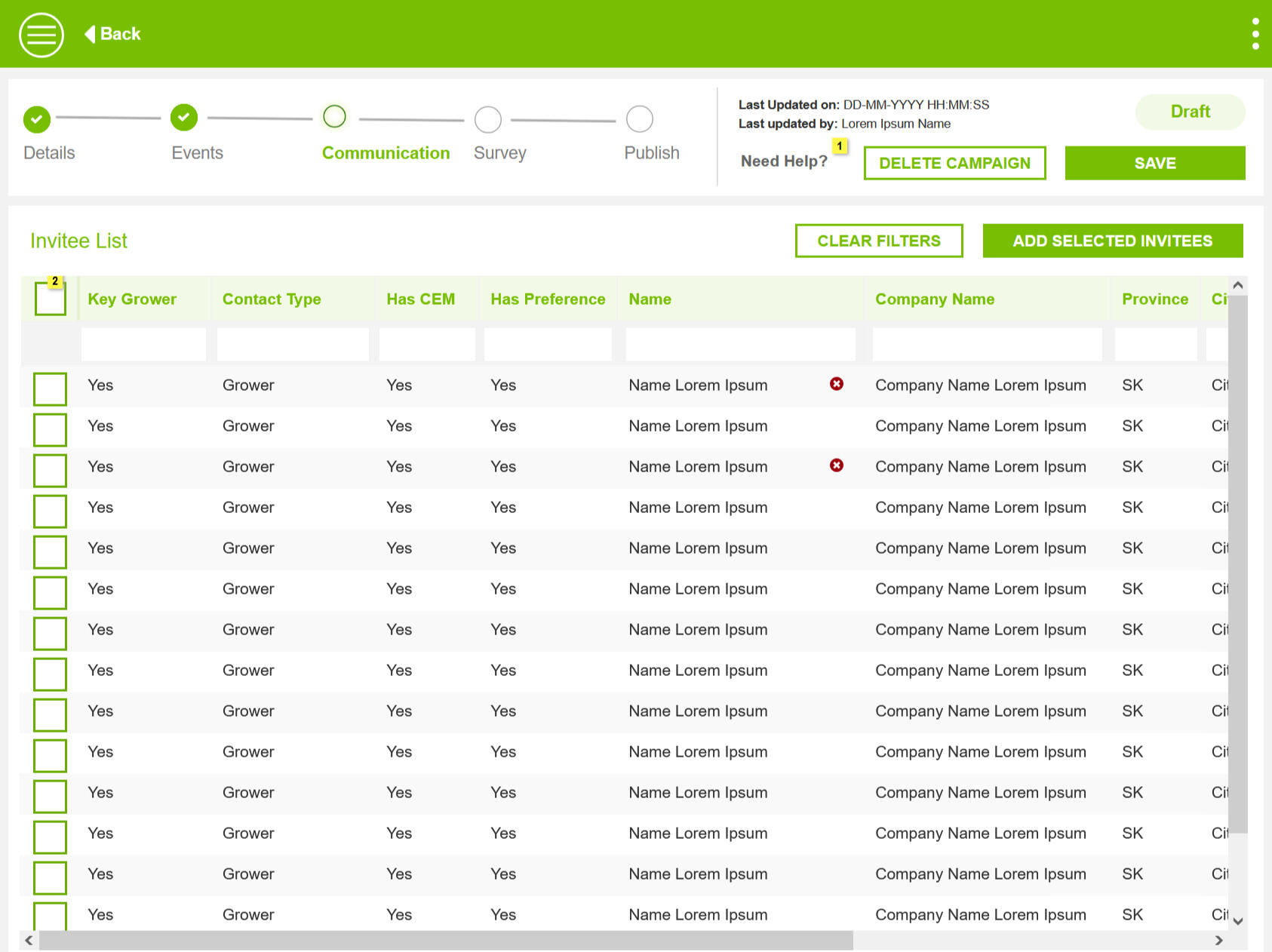
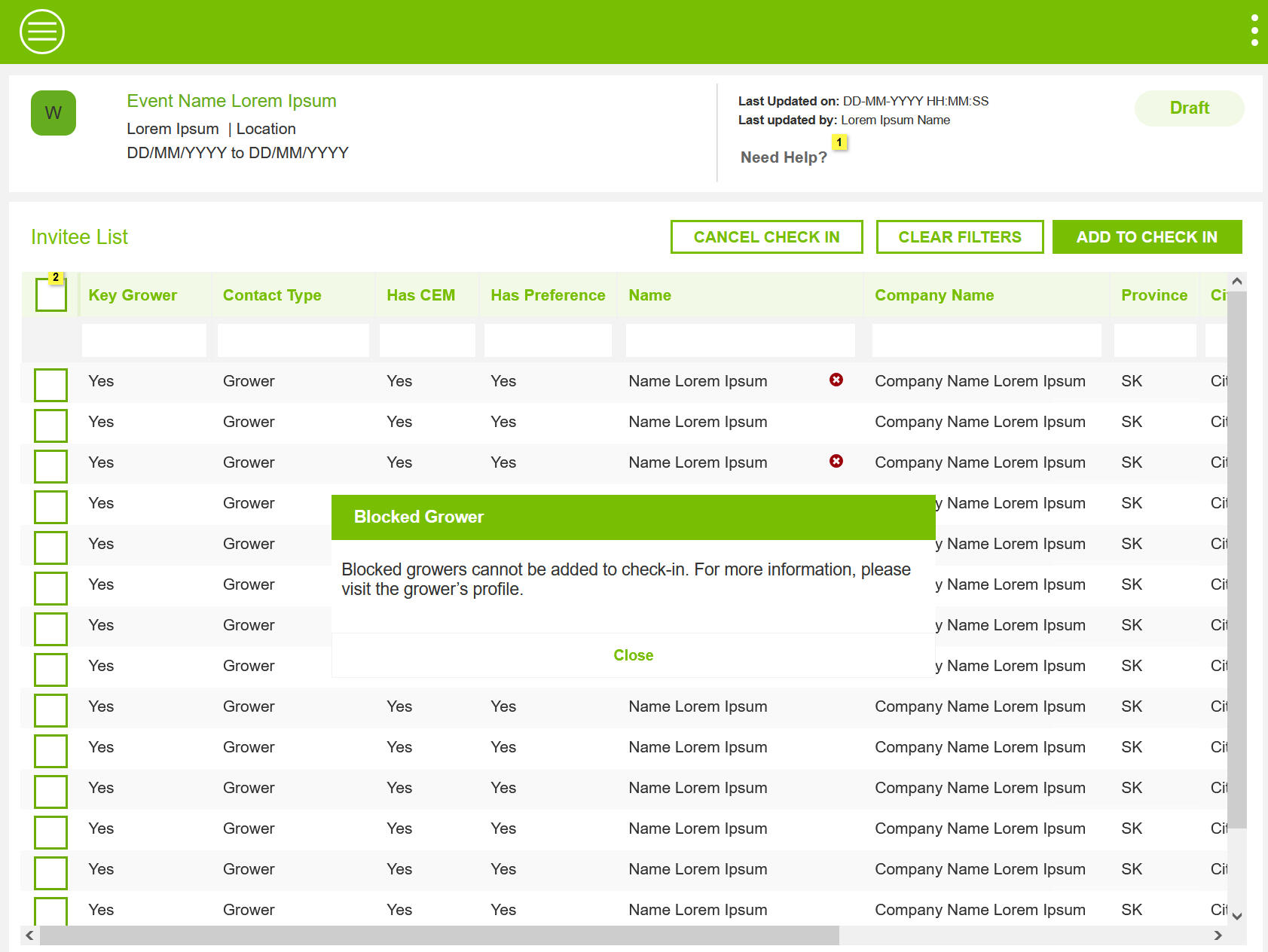
Grid
Inline Flags will be displayed in Grids, where a blocked grower is displayed.
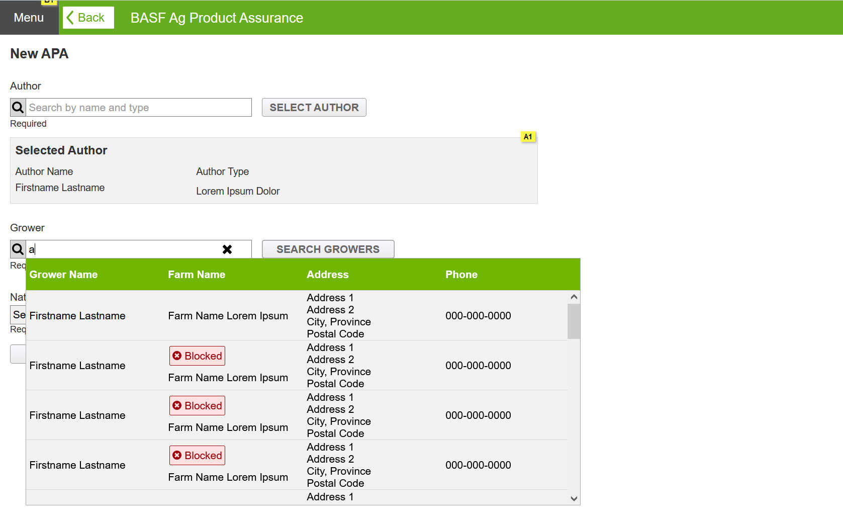
Typeahead
Blocked flag will be displayed when searching for a user in a database.
Action Button
Instances were identified where hiding Action buttons from view was not possible. In these instances, an overlay message is displayed with an error message and suggesting corrective steps for the user to proceed further.

Key Design Elements
The design solutions guide provides clear and actionable guidelines for implementing effective design solutions. It ensures consistency and usability across projects by detailing best practices, common patterns, and design principles.
Clean and Minimal Design to apply across Applications
Responsive Components and elements.
Patterns helped implement effective solutions.
Banners
Error Banne is used to inform users something critical has happened and requires immediate attention. These banner do not have dismiss option and will be view at all times.
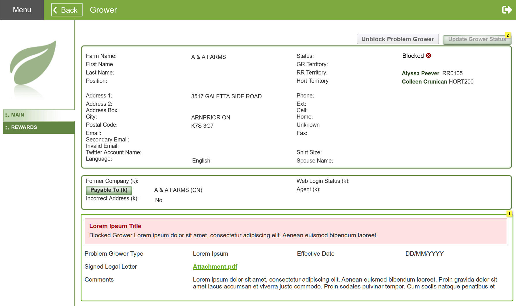
Flags
Error flags with User Status "Blocked" is shown in Grids and Form pages where User Name is displayed.
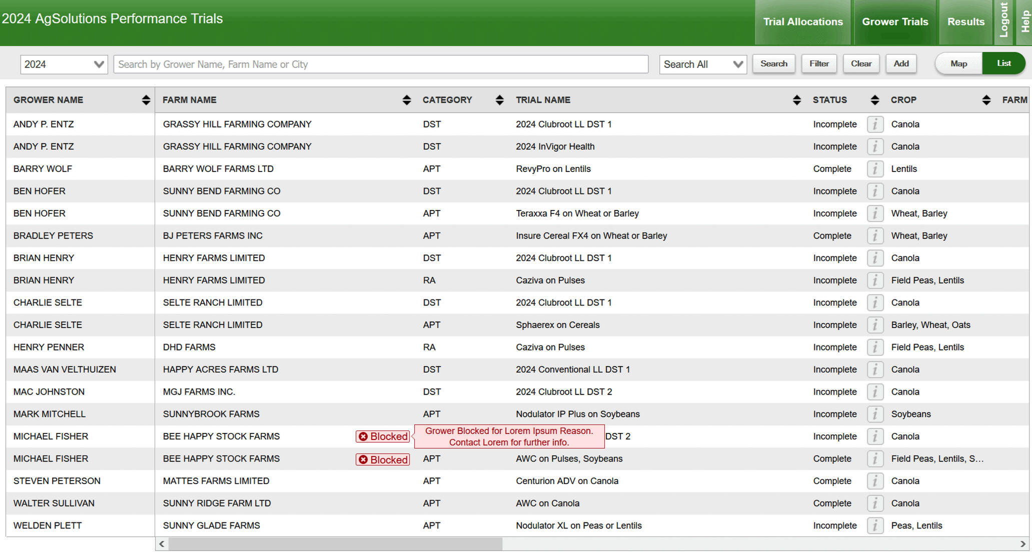
Icons
Error Icons with a popup is shown on grids and form pages where there is space limitations. Recommendation was to use as sparingly as possible.
Modal dialog
In User flows, when all previous checkpoints to inform a Blocked user is missed and the user performs an action. Error Dialog is shown and further processing is stopped, until the suggested corrective actions are taken.
Design Review and Feeback
I conducted comprehensive design reviews to collect detailed feedback from stakeholders and users. This iterative process allowed me to refine the design based on their insights, ensuring that it effectively addressed user needs and aligned with project goals.
Solutions for Unblocking Users
During the walkthrough, an additional requirement emerged. Now that the system can block users, it must also provide ability to unblock an user in the future, if need be.
Solution
Added a new user flow and relevant screen designs.

Gaps in Understanding and Workflow
Product owners pointed out a few instances in the blocked user solution, where user flow ends much earlier than designed.
Solution
Updated user flows remove extra steps in the user flows.
Additional Common Patterns
Developers pointed out instances of proposed solutions that had gaps in managing blocked users, especially in Data Grids.
Solution
Recommended a solution that reused an existing design pattern
Retrospection
The Design Team had a discussion to review the project. We had two key learnings. When designing future applications, consider potential worst-case scenarios and ensure the product can handle them. Keep a log of possible solutions for uncommon issues, so you're prepared to respond effectively if they arise.